Menu
Designing brands that own the room, break the mold, and drive connection. Strategy, story, and stunning creative ... together.
Work
ENC Labs
About
Method
Services
ENCsider
SiteofSites
Press
Contact
We handle
everything
Video
Social Media
Packaging
Marketing Collateral
EGC
Naming
Brand Messaging
Email
Retail
Print
Strategy
Web Design
Campaign
Branding
for
everyone
Education
Interior Design
Architecture
Health & Wellness
Real Estate
Hospitality
Food & Beverage
Sustainability
Lifestyle
Fashion
Beauty
Food & Beverage
Kauboi
From Dinner Reservation To a Night That Unfolds
Brand Messaging
Branding
Campaign
EGC
Marketing Collateral
Hospitality
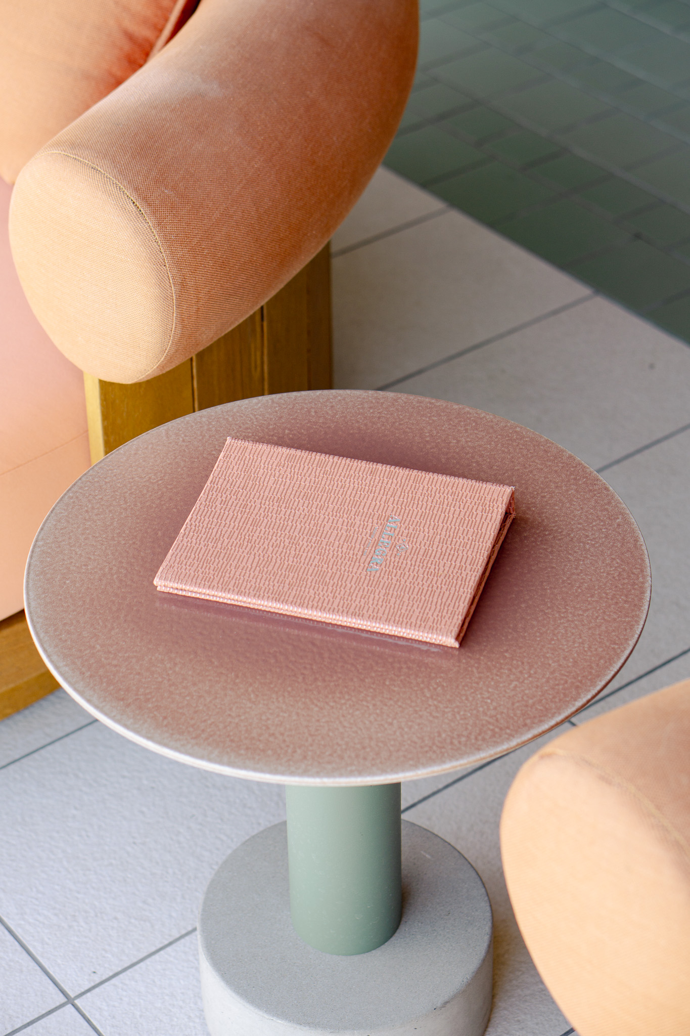
Allegra
Beyond the Rooftop
Brand Messaging
Campaign
Marketing Collateral
Social Media
Video
Lifestyle
A Little Lift
Pocket-Sized Actions. Real-World Good.
Brand Messaging
Branding
Web Design
Campaign
Social Media
Food & Beverage
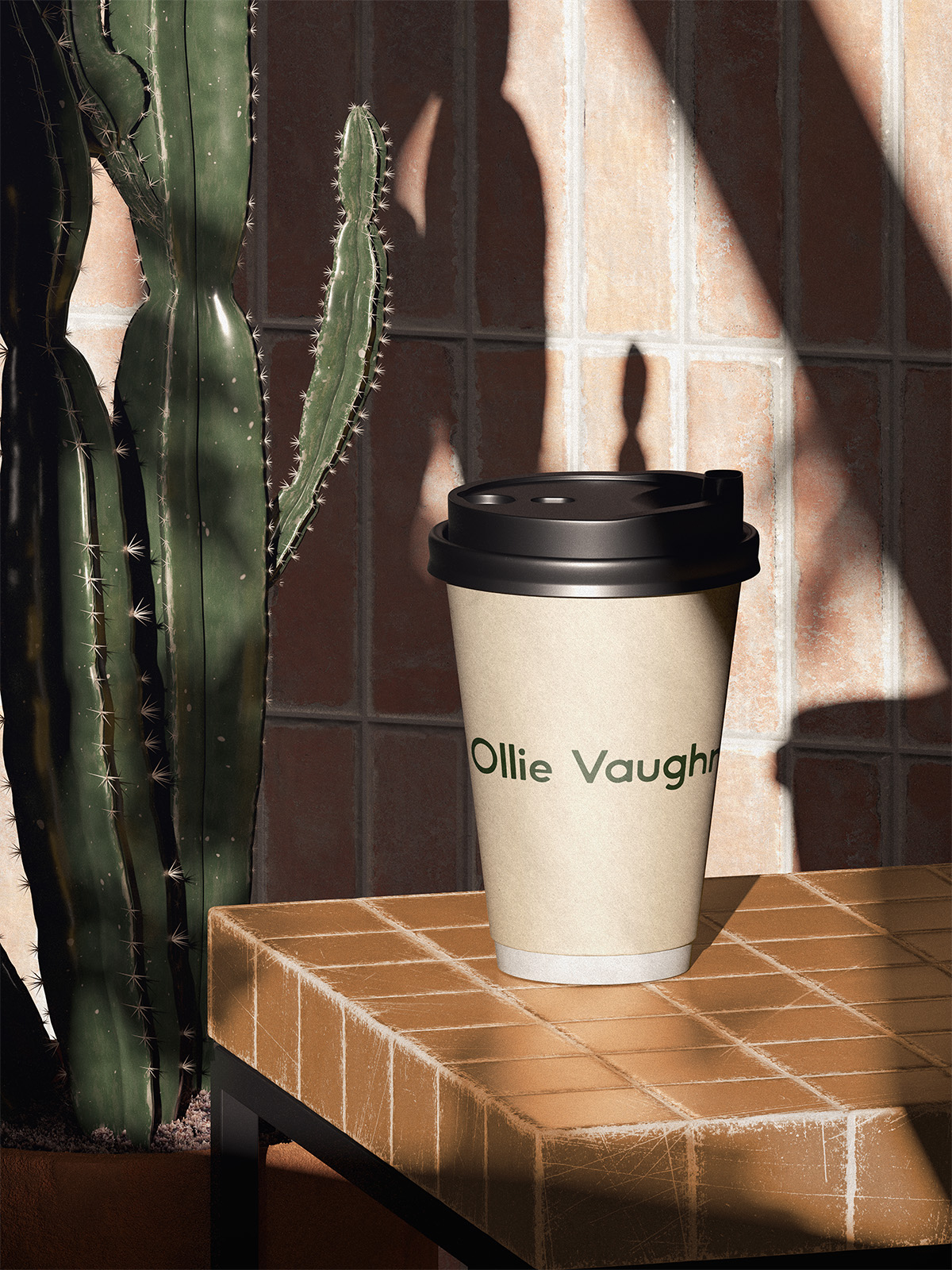
Ollie Vaughns
Refining the Story Behind A Phoenix Institution
Branding
Brand Messaging
Marketing Collateral
Health & Wellness
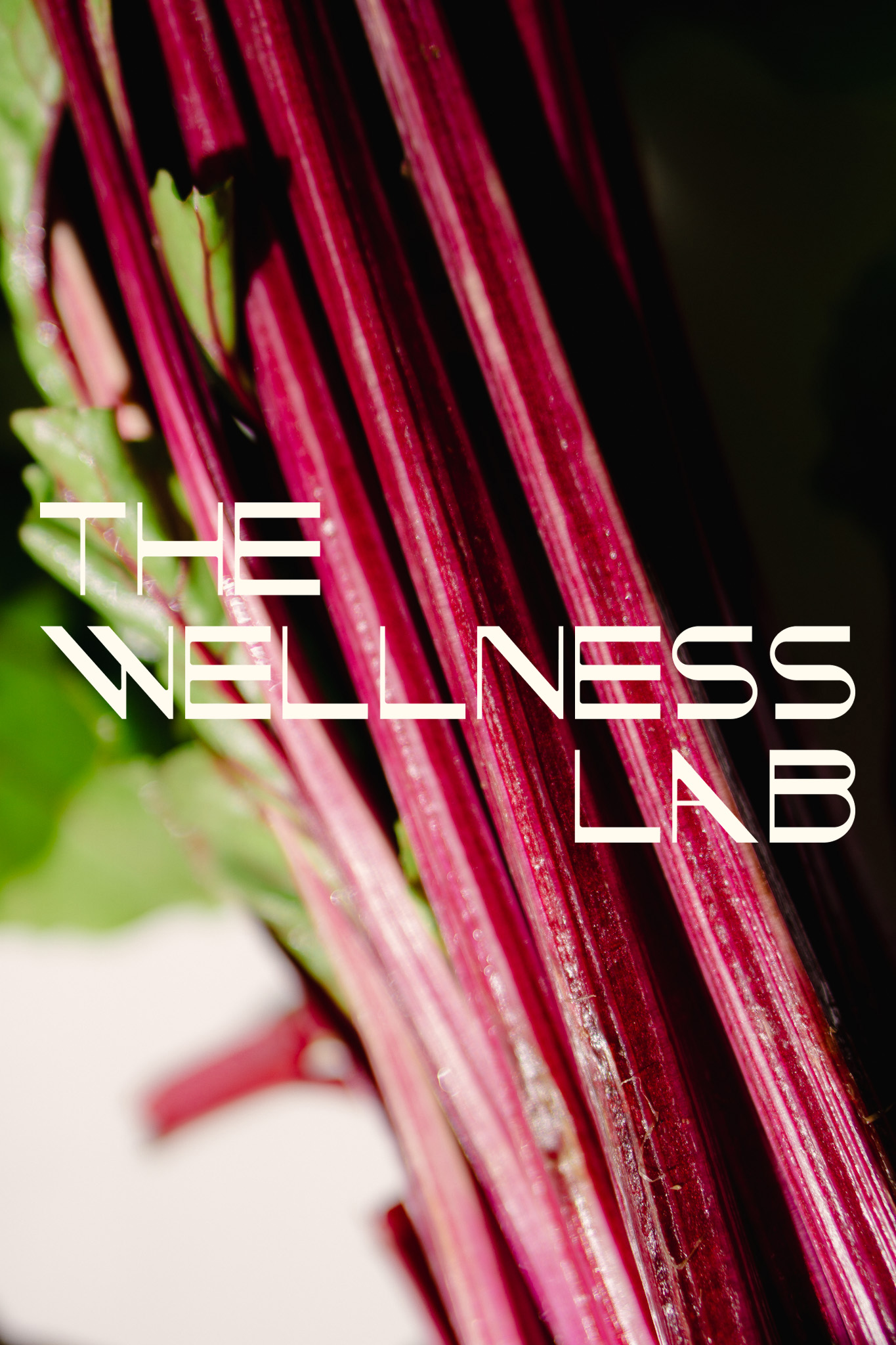
The Wellness Lab
From Healthcare as It Is to Wellness as It Should Be
Branding
Brand Messaging
Campaign
Naming
Social Media
Food & Beverage
Handsy
Raw. Rolled. Ready when you are.
Branding
Brand Messaging
Campaign
Print
Web Design
Food & Beverage
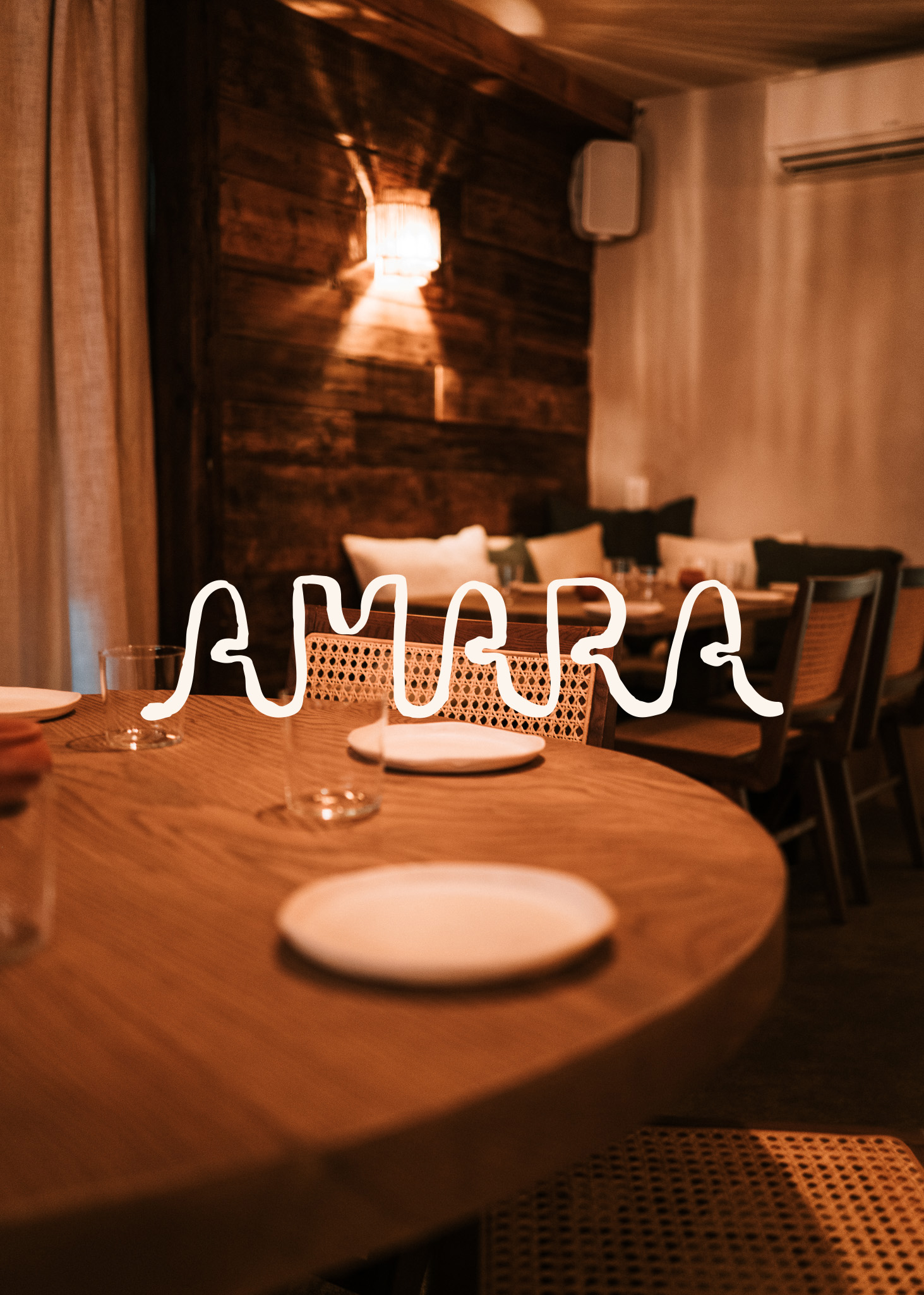
Amara
sip. share. stay awhile.
Brand Messaging
Branding
Print
Social Media
Web Design
Lifestyle
Love Day
Love looks different here.
Brand Messaging
Branding
Campaign
Marketing Collateral
Naming
Interior Design
KS Designs
Artful Spaces, Lived-in Ease
Brand Messaging
Branding
Web Design
EGC
Social Media
Food & Beverage
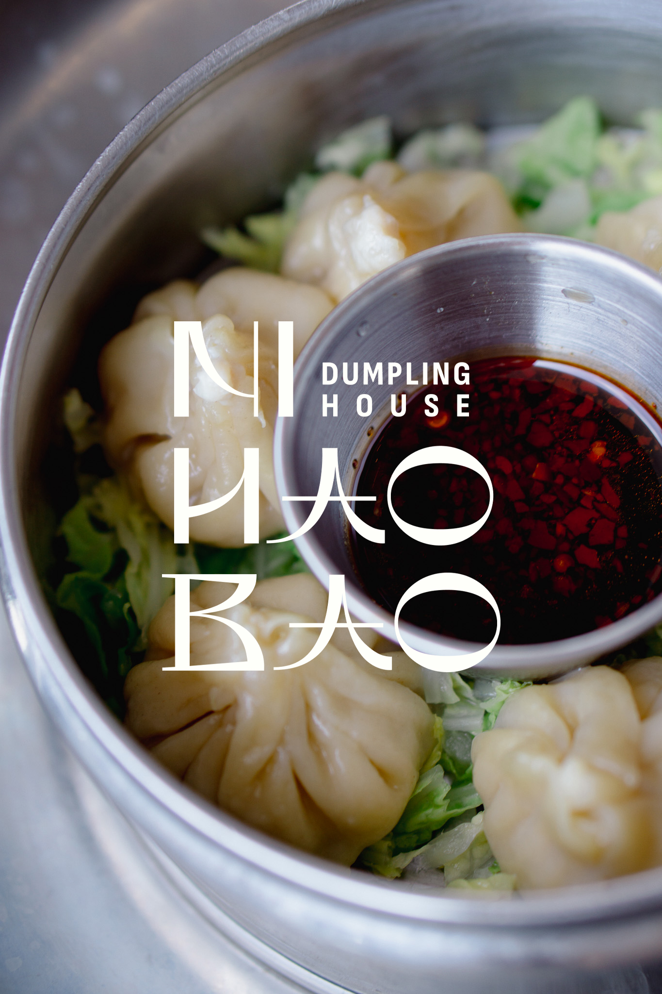
Ni Hao Bao
Fresh folds. Street roots. A dumpling house built to scale.
Brand Messaging
Branding
Print
Health & Wellness
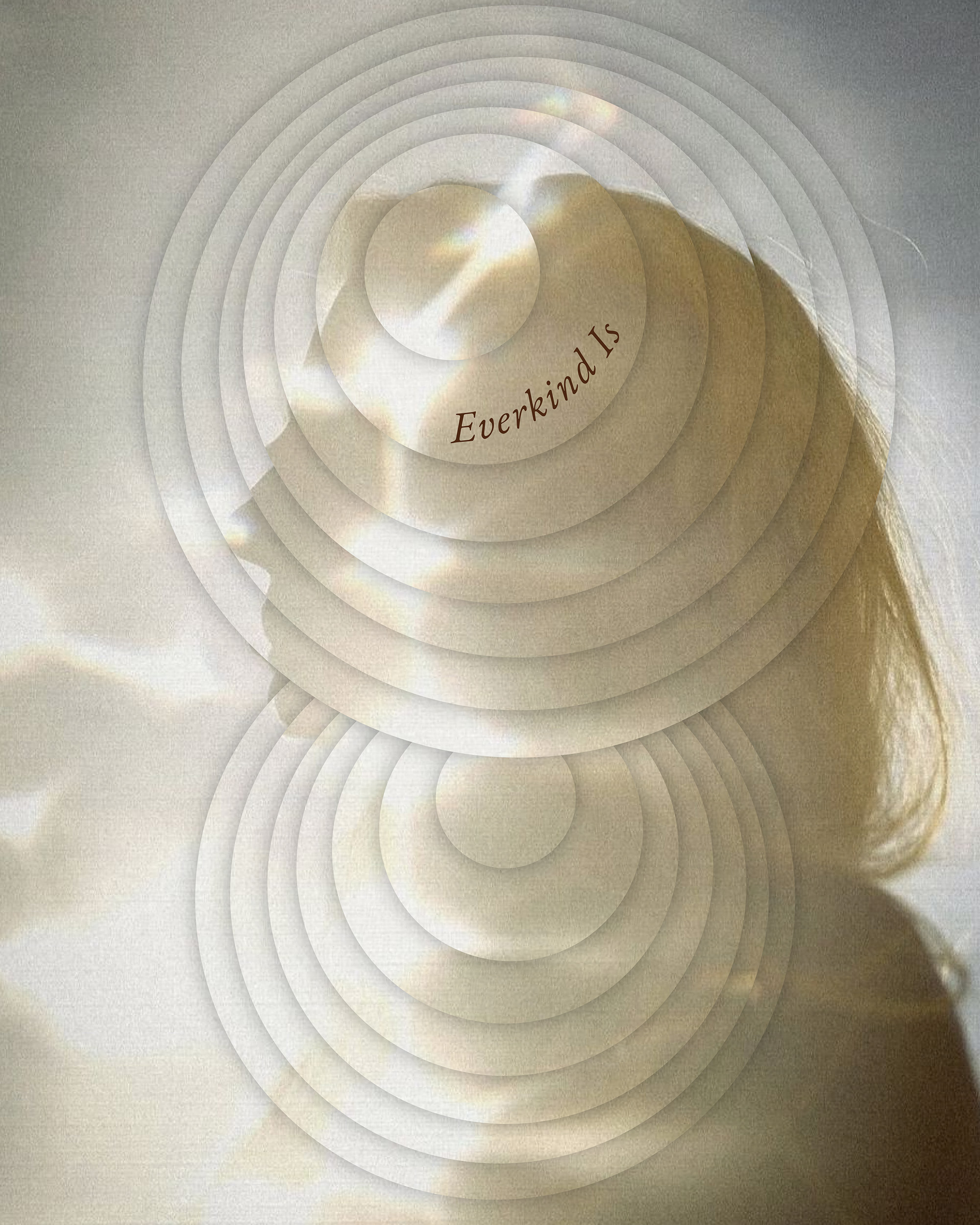
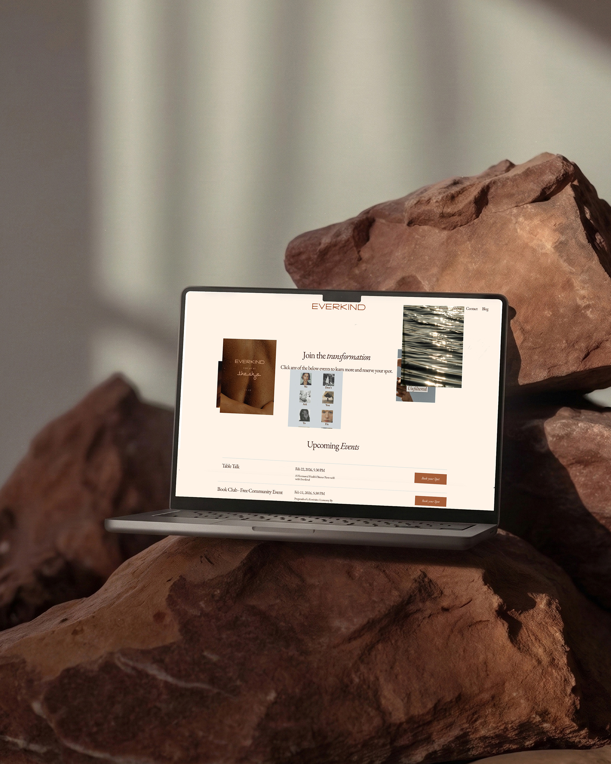
Everkind
A new kind of kind
Brand Messaging
Branding
Marketing Collateral
Naming
Print
Food & Beverage
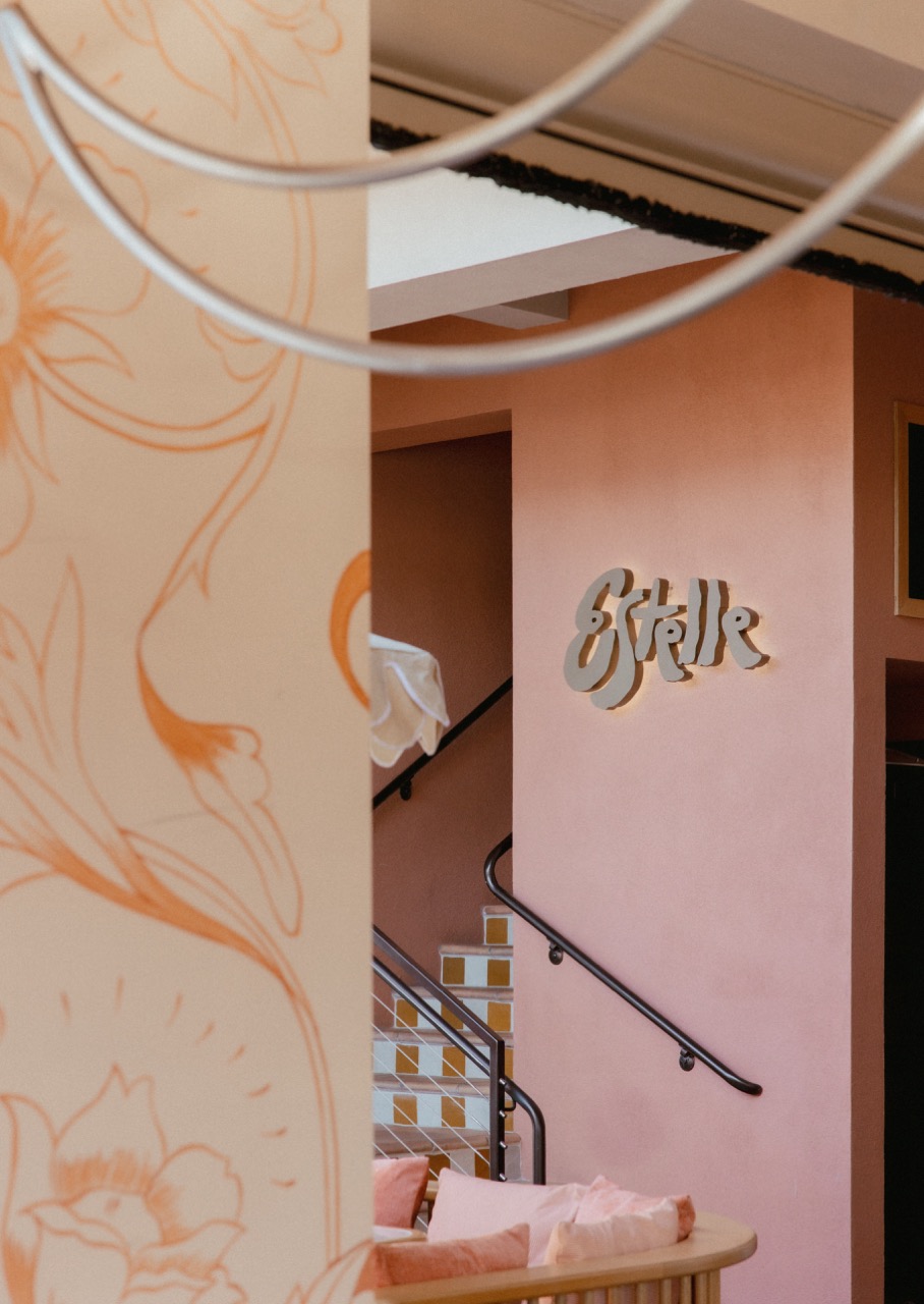
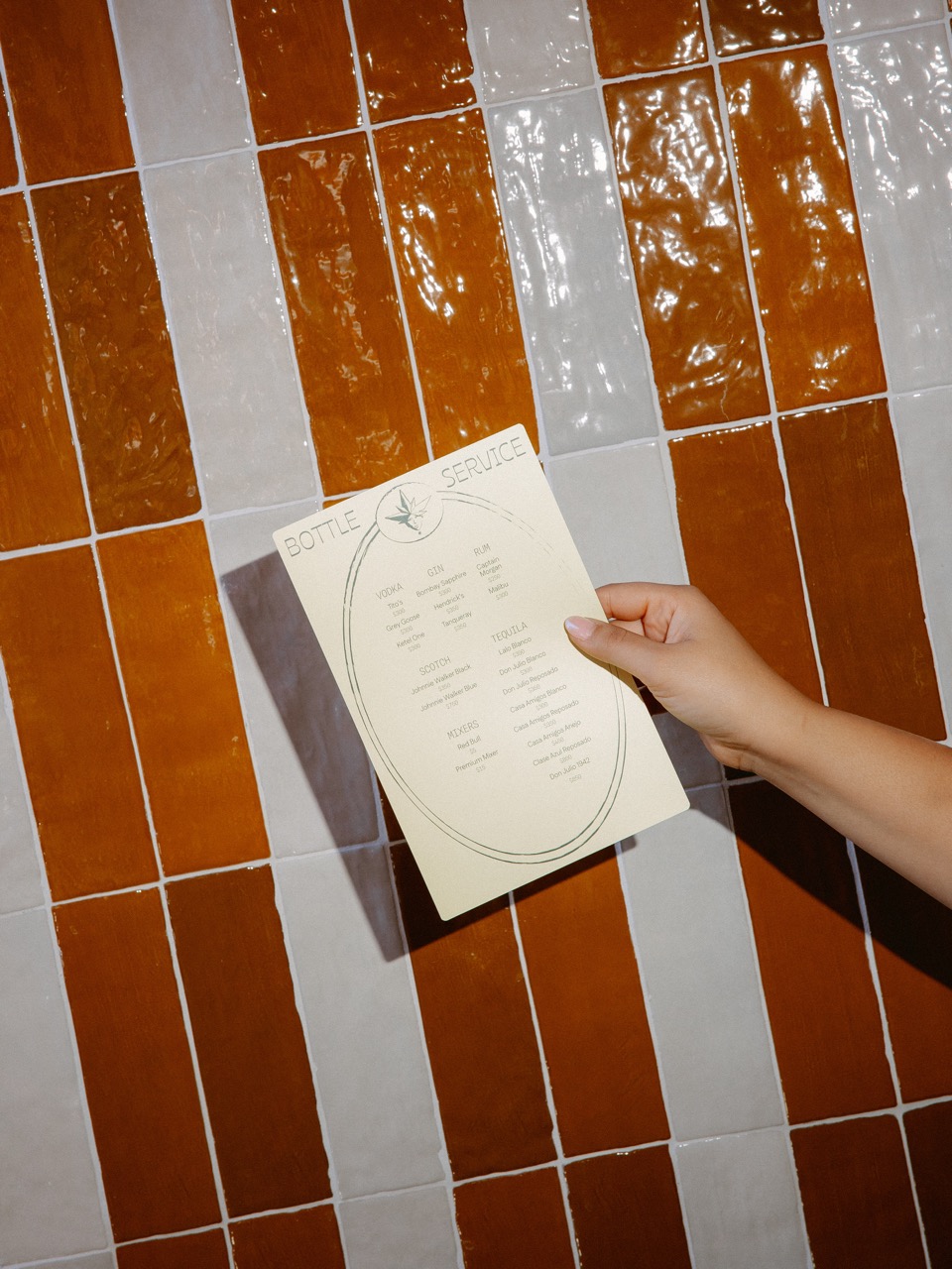
Estelle
Estelle doesn’t do arrivals. Only entrances.
Brand Messaging
Branding
Campaign
Marketing Collateral
Naming
Interior Design
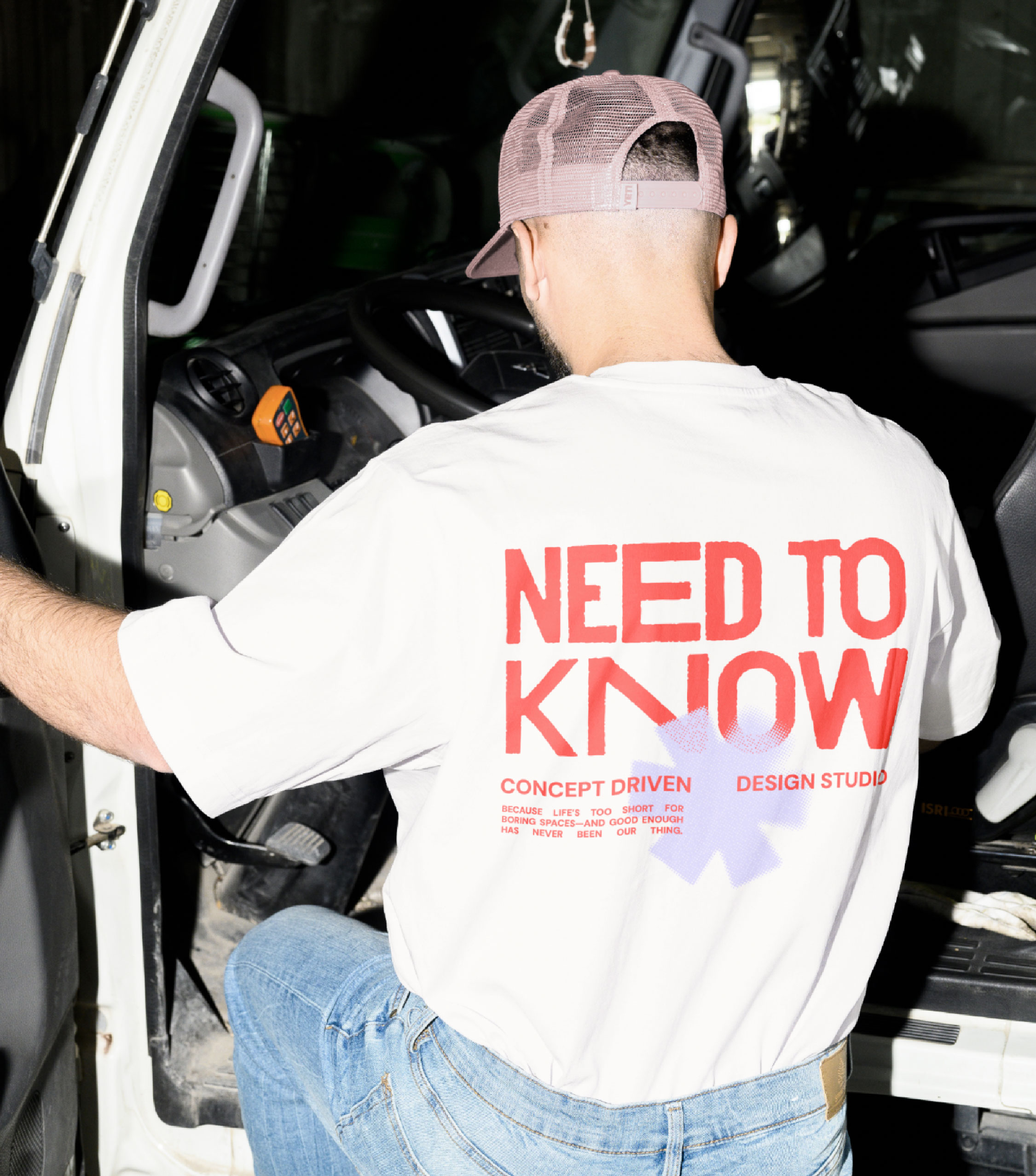
Need To Know
Concept Driven Design Studio
Branding
Campaign
Marketing Collateral
Social Media
Web Design
Health & Wellness
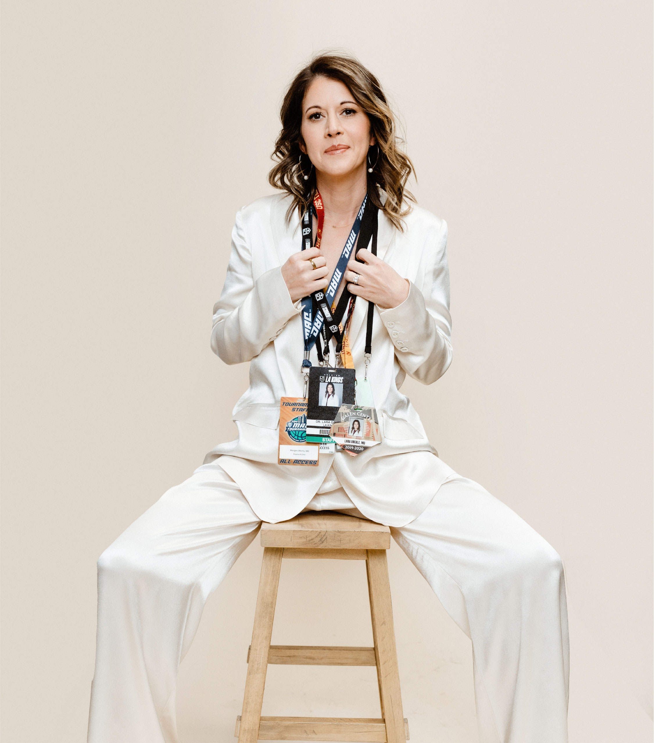
Sports Doctor Morgan
Motherhood is a sport. Train accordingly.
Brand Messaging
Branding
Web Design
Lifestyle
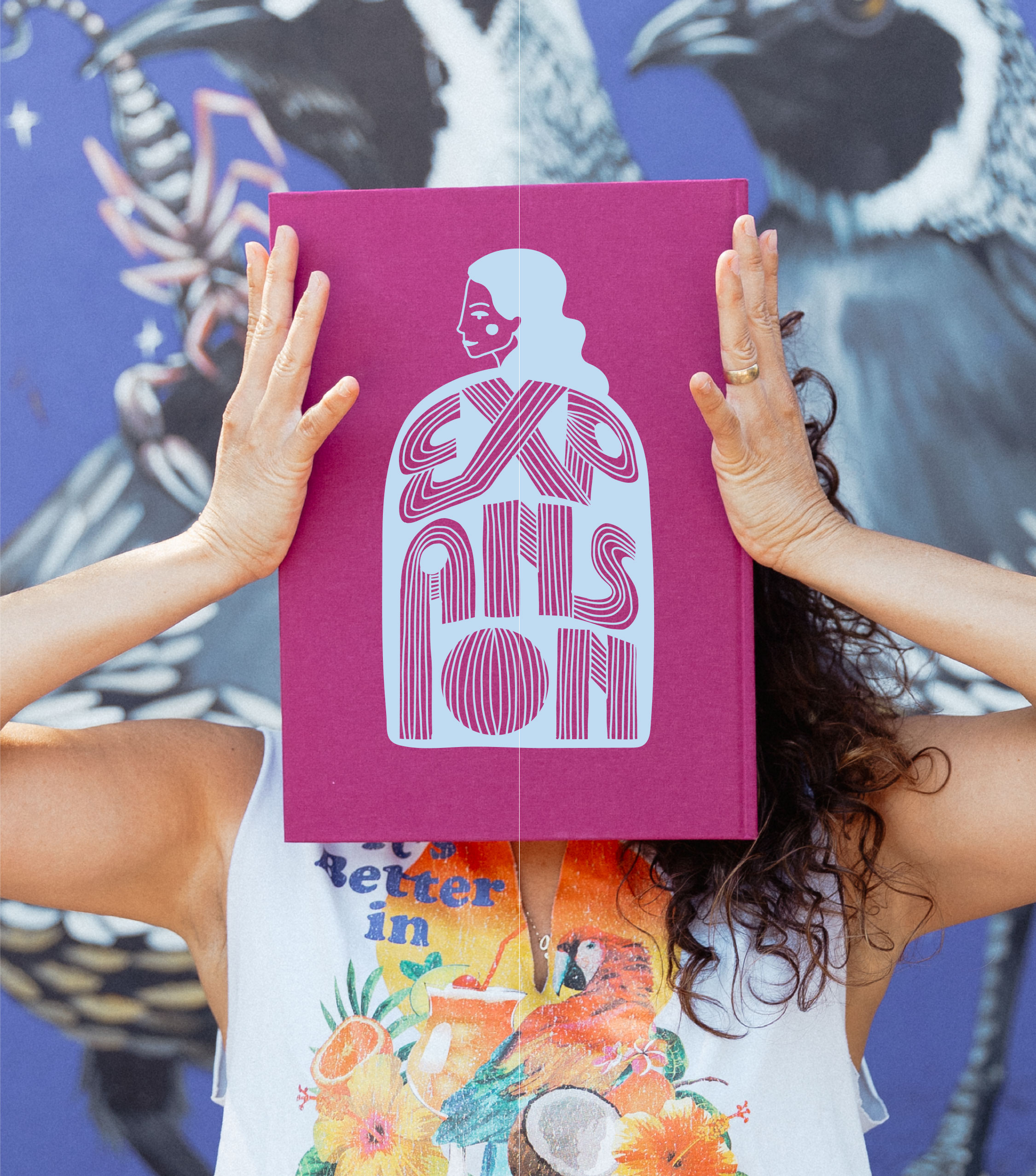
Expansion By Maybe
Expansion, Embodied
Brand Messaging
Branding
Campaign
Social Media
Web Design
Interior Design
Jubilee Interiors
Sanctuary Starts Here
Brand Messaging
Branding
Campaign
Social Media
Web Design
Fashion
Dylann Wolfe
Born of the sea. Bound to Protect It.
Brand Messaging
Branding
Web Design
Food & Beverage
Teaspressa
Branding
Web Design
Campaign
Social Media
Email
Food & Beverage
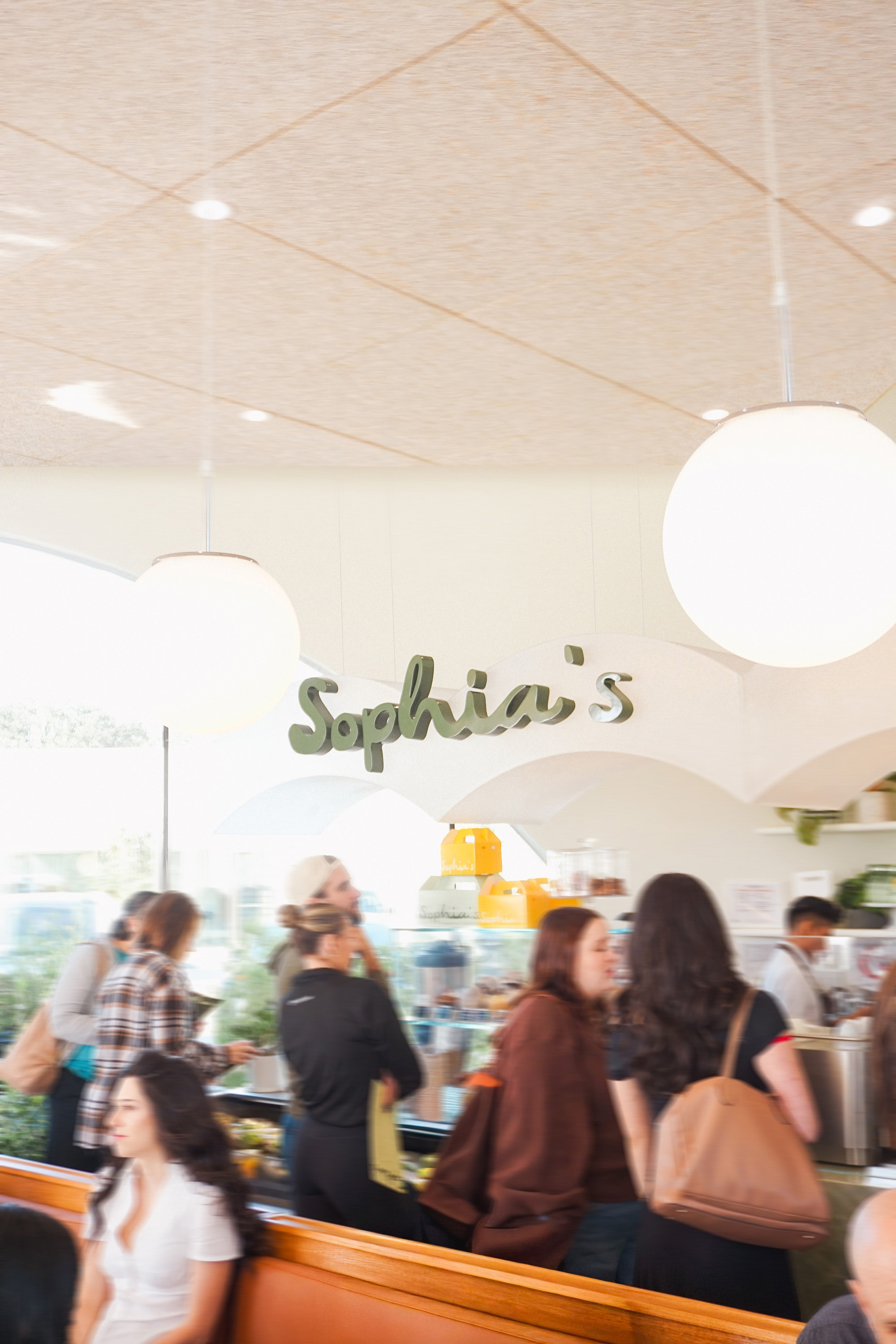
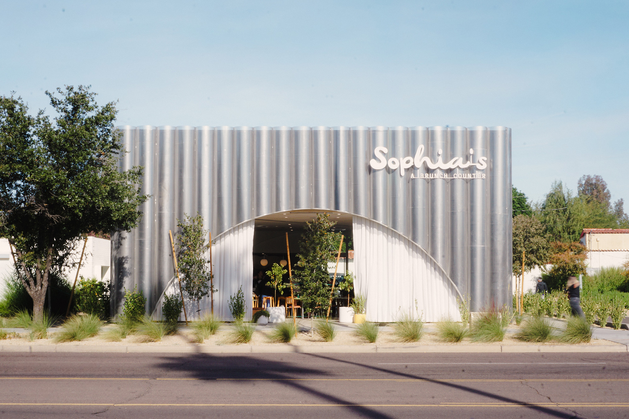
Sophias
The Daily Done Different
Brand Messaging
Branding
Marketing Collateral
Print
Retail
Fashion
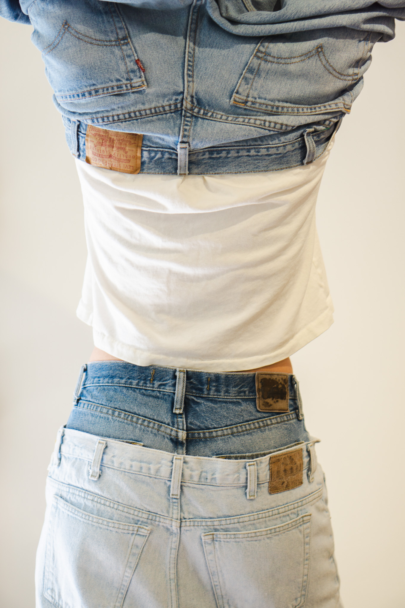
Fischer Goods
Worn in, not worn out
Brand Messaging
Branding
Web Design
Campaign
Hospitality
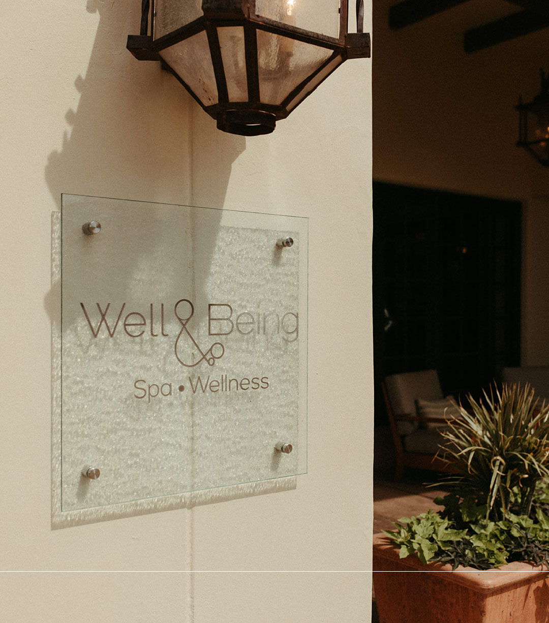
Well and Being - Fairmont Scottsdale
Strategy
Social Media
Campaign
Beauty
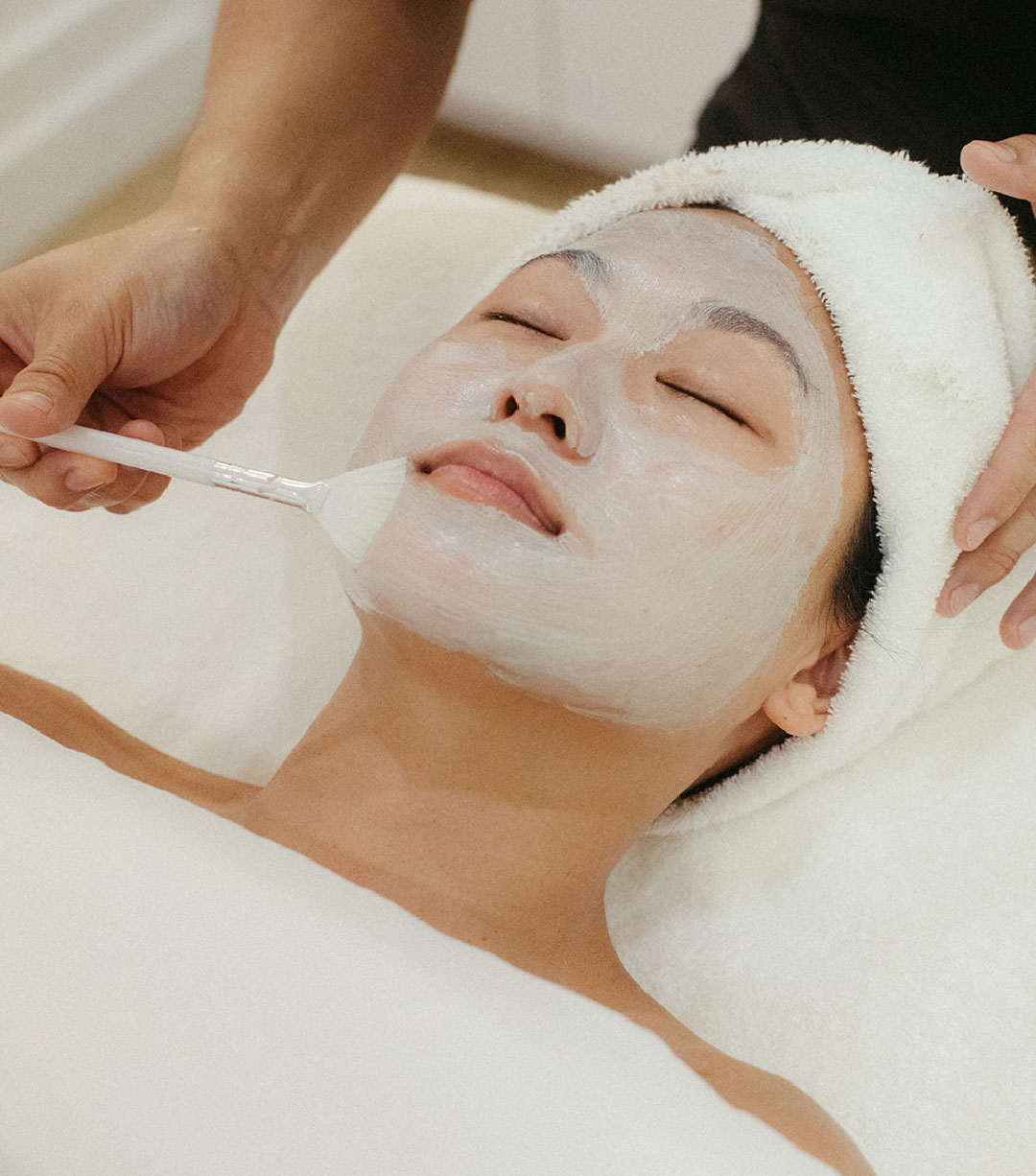
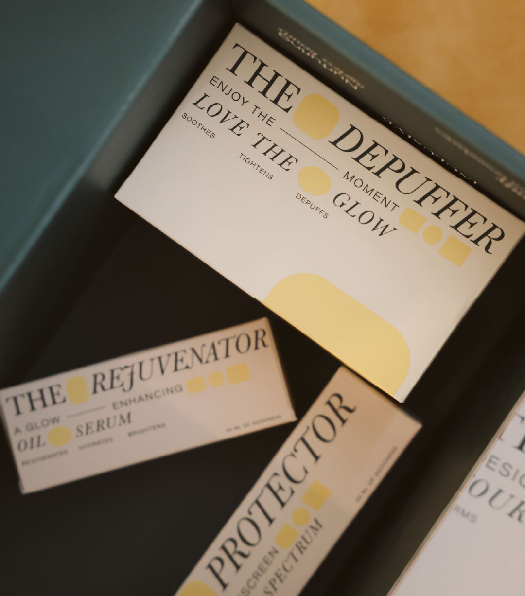
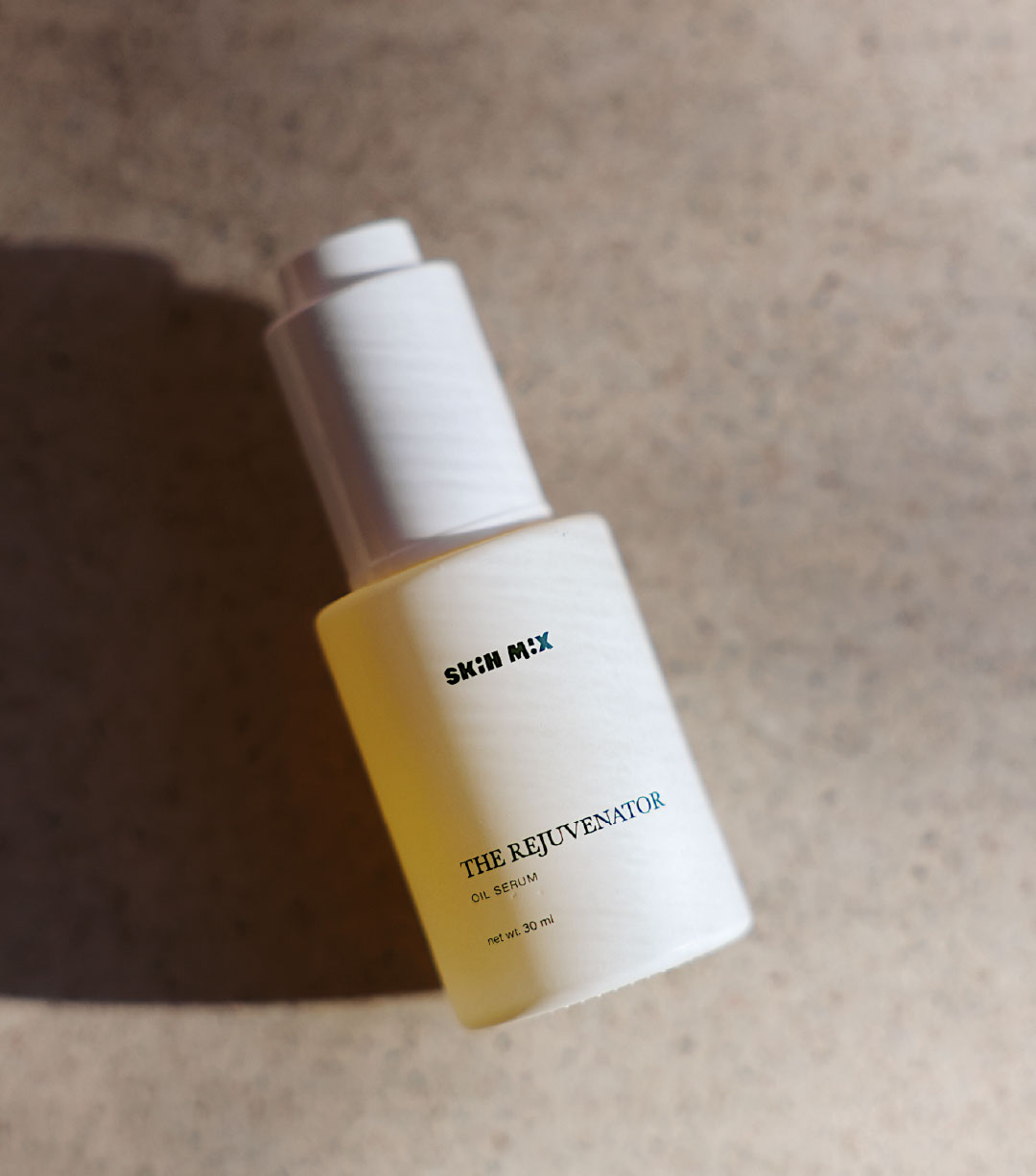
Skin Mix
Take the Spa Glow Home with You
Strategy
Packaging
Branding
Lifestyle
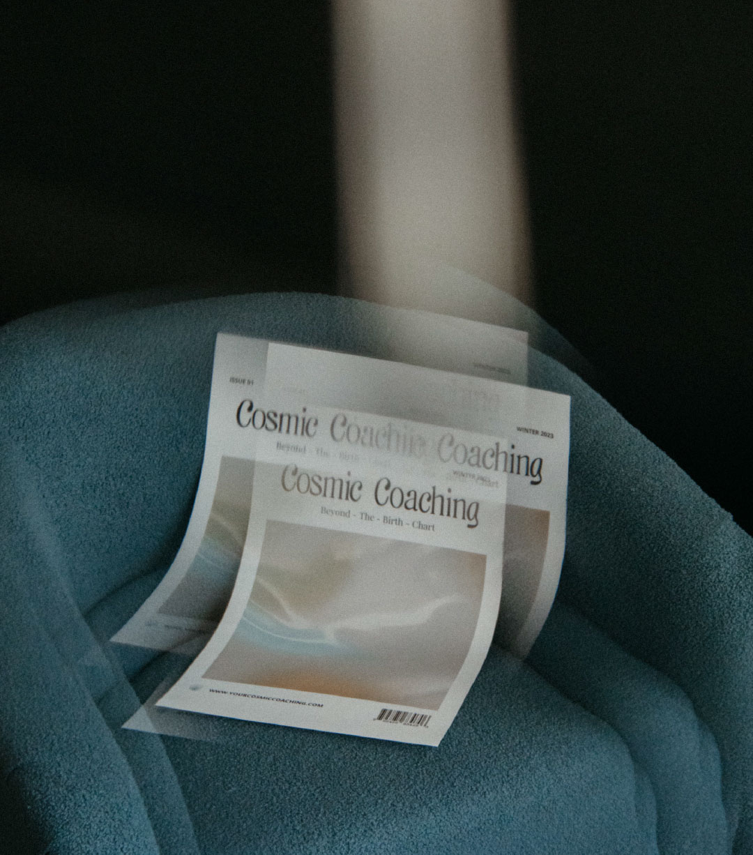
Cosmic Coaching
A New Era of Astrology
Naming
Branding
Web Design
Campaign
Social Media
Health & Wellness
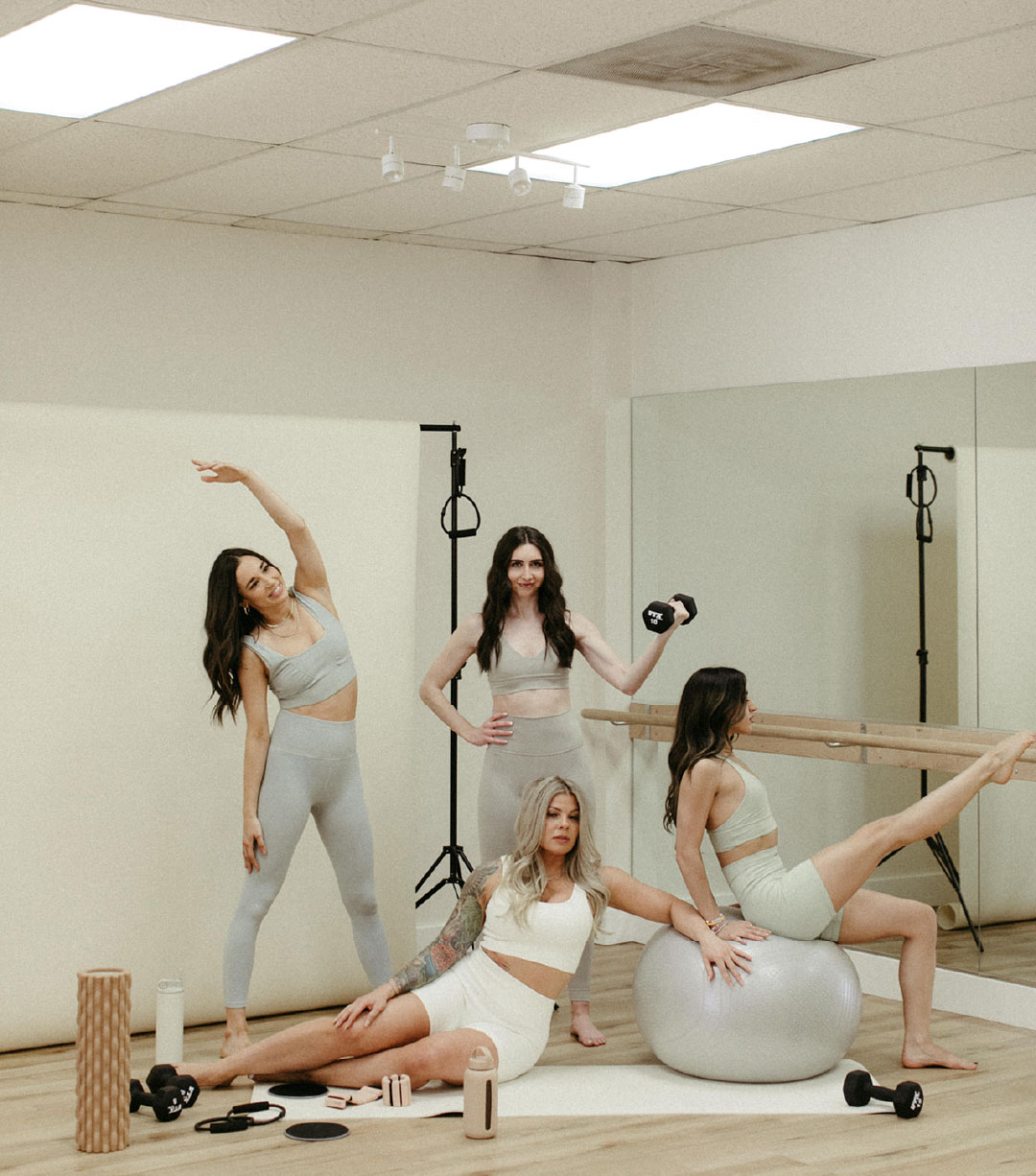
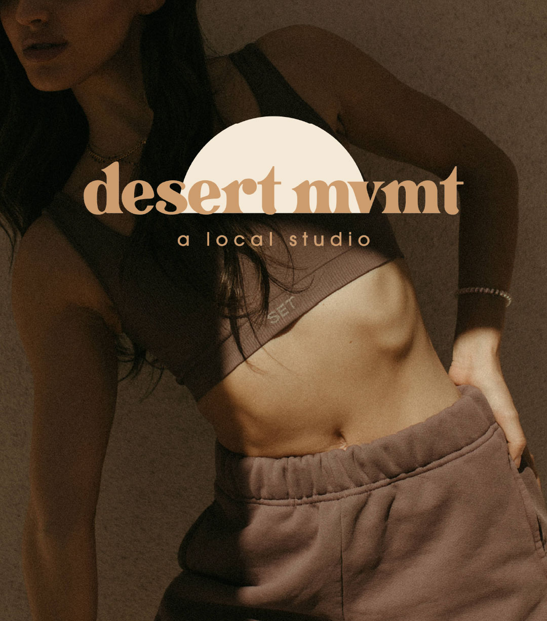
Desert MVMT
We'll Make the First Move
Branding
Campaign
Naming
Social Media
Print
Beauty
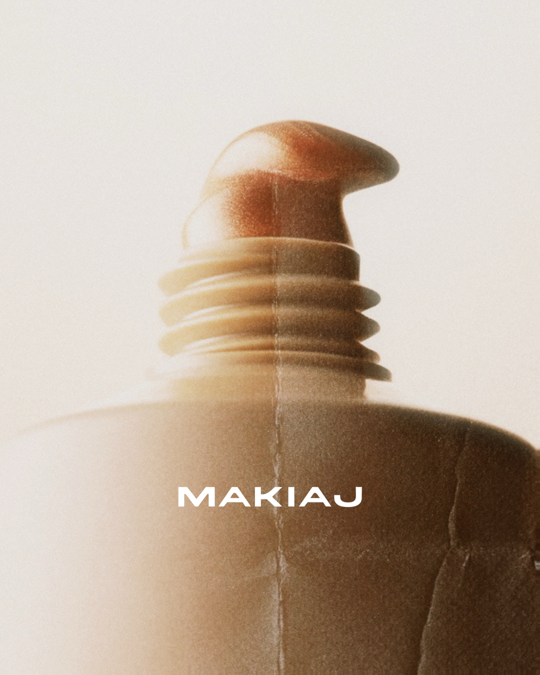
Makiaj
She is the Every Woman
Branding
Campaign
Web Design
Social Media
Packaging
Beauty
Two of a Kind
Kind Brow Club
Campaign
Print
Web Design
Retail
Beauty
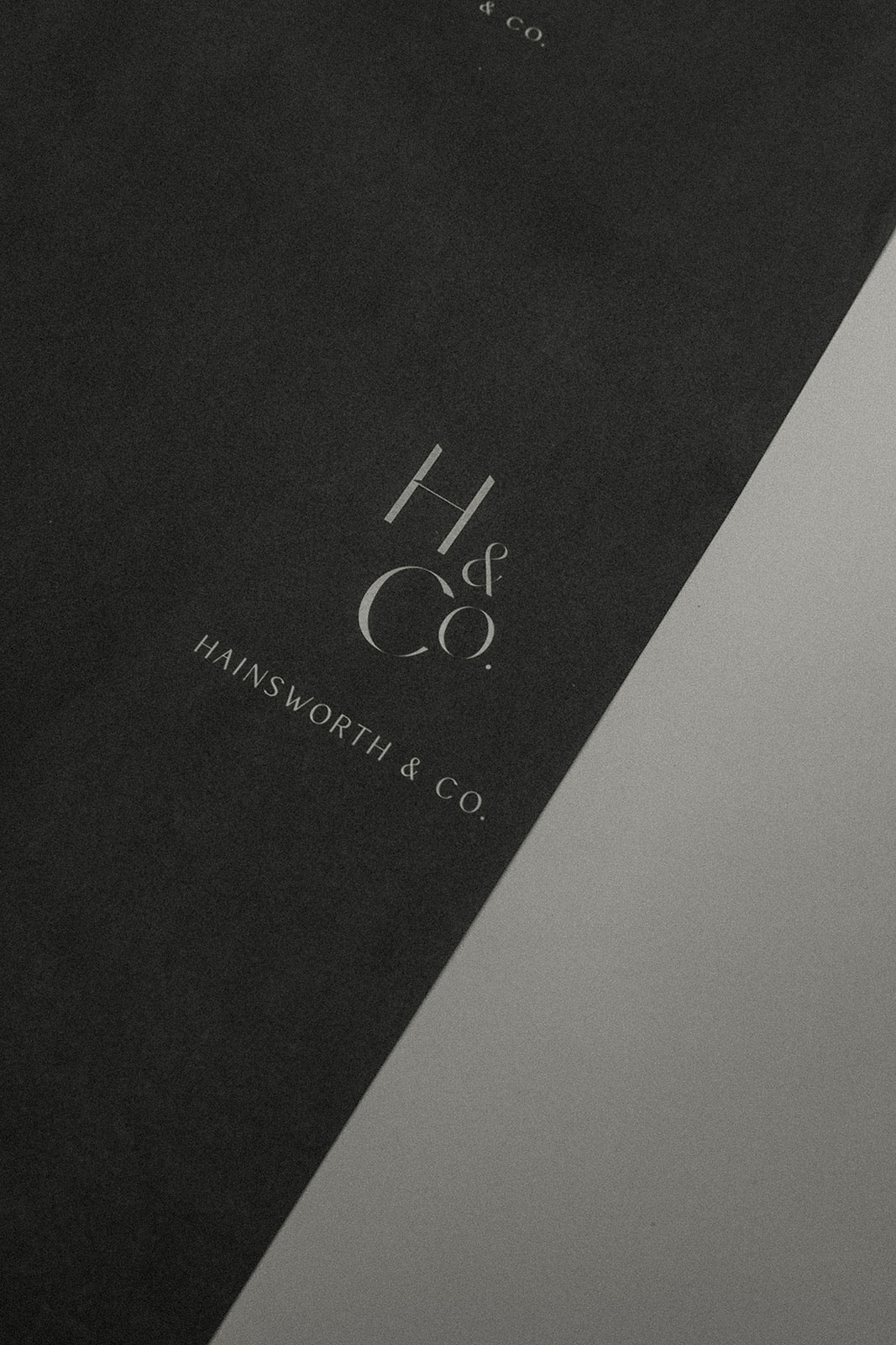
Hainsworth
Hair That Speaks Volumes: A Brand Evolution Rooted in Care, Craft, and Community
Branding
Campaign
Marketing Collateral
Print
Retail
Education
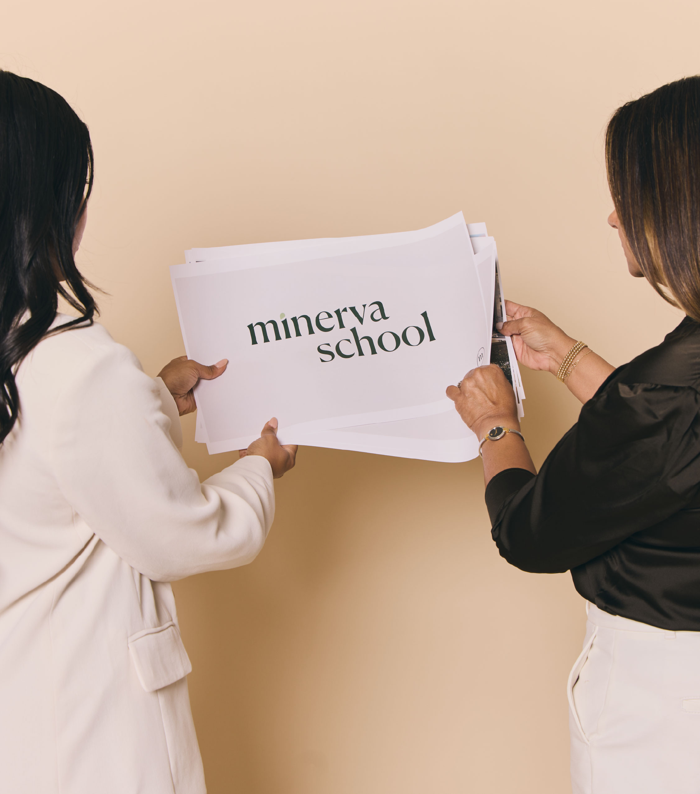
Minerva
Where Language, Legacy, and Leadership Begin
Brand Messaging
Campaign
Email
Social Media
Architecture
Visionary Landscapes
Design that Grows with You
Branding
Web Design
Real Estate
Arizona Abode
Bringing the Abode Home
Branding
Naming
Interior Design
Known Goods
From the Floor Up: This Isn't Just a Rug Line, This is Known Goods
Branding
Campaign
Naming
Web Design
Interior Design
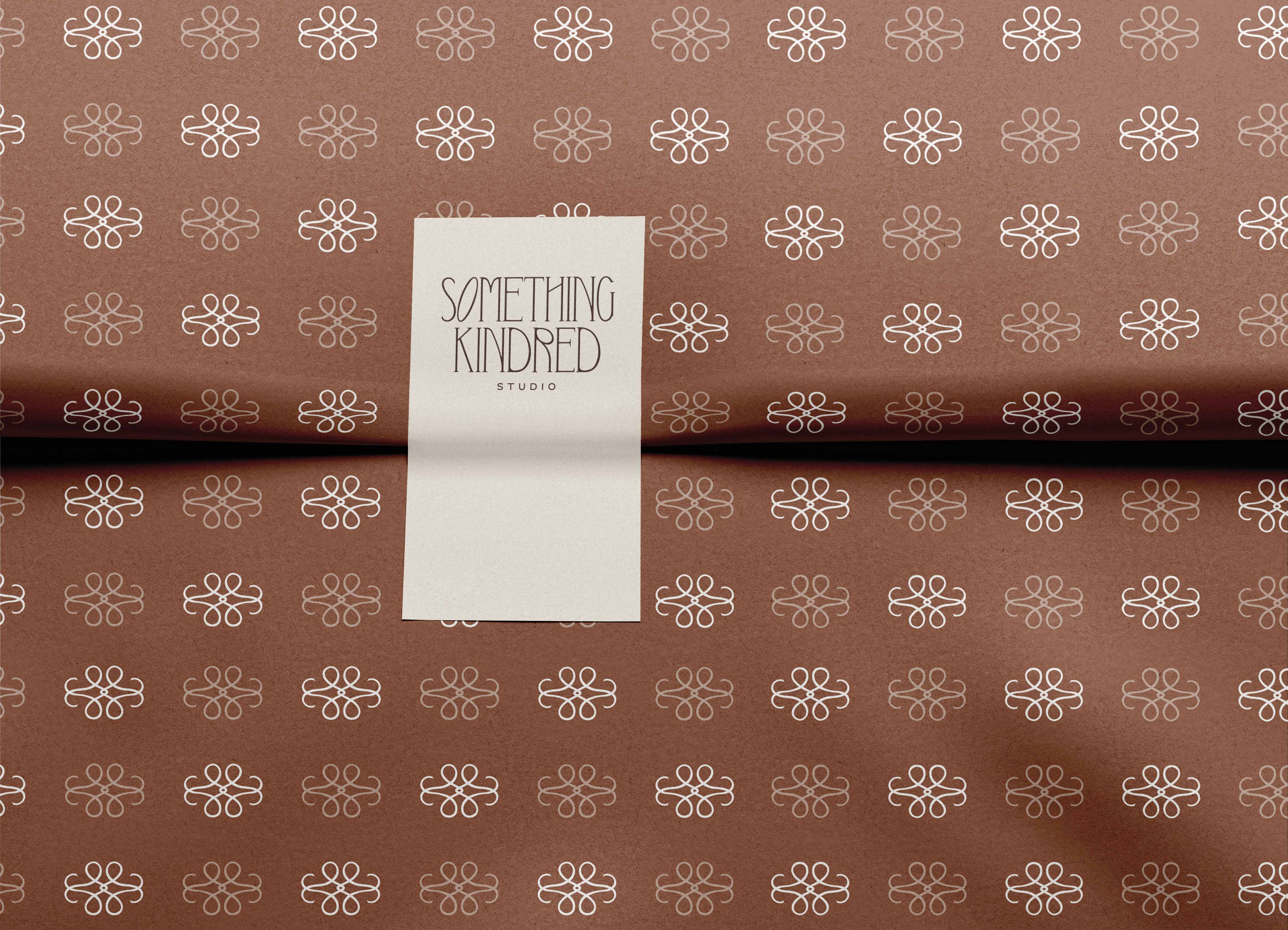
Something Kindred
Redefining the Familiar
Branding
Naming
Social Media
Health & Wellness
The Foundry
Find Your Fire
Brand Messaging
Campaign
Retail
Social Media
Web Design
Education
Vista College Prep
Aim Higher, Go Further
Brand Messaging
Branding
Campaign
EGC
Marketing Collateral
Health & Wellness
Off Duty Rituals
Take Up Space
Campaign
Print
Beauty
Plush Laser
The Plush Difference
Brand Messaging
Campaign
EGC
Marketing Collateral
Print
Beauty
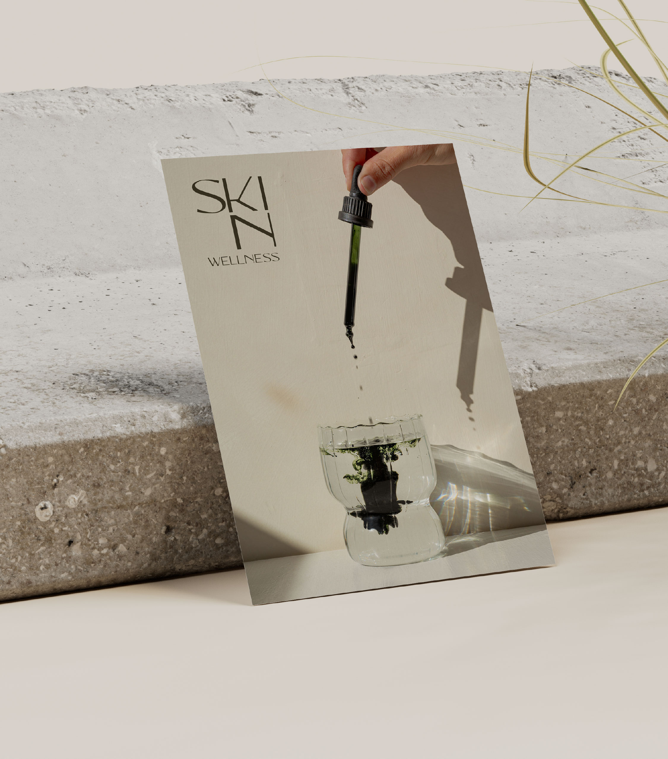
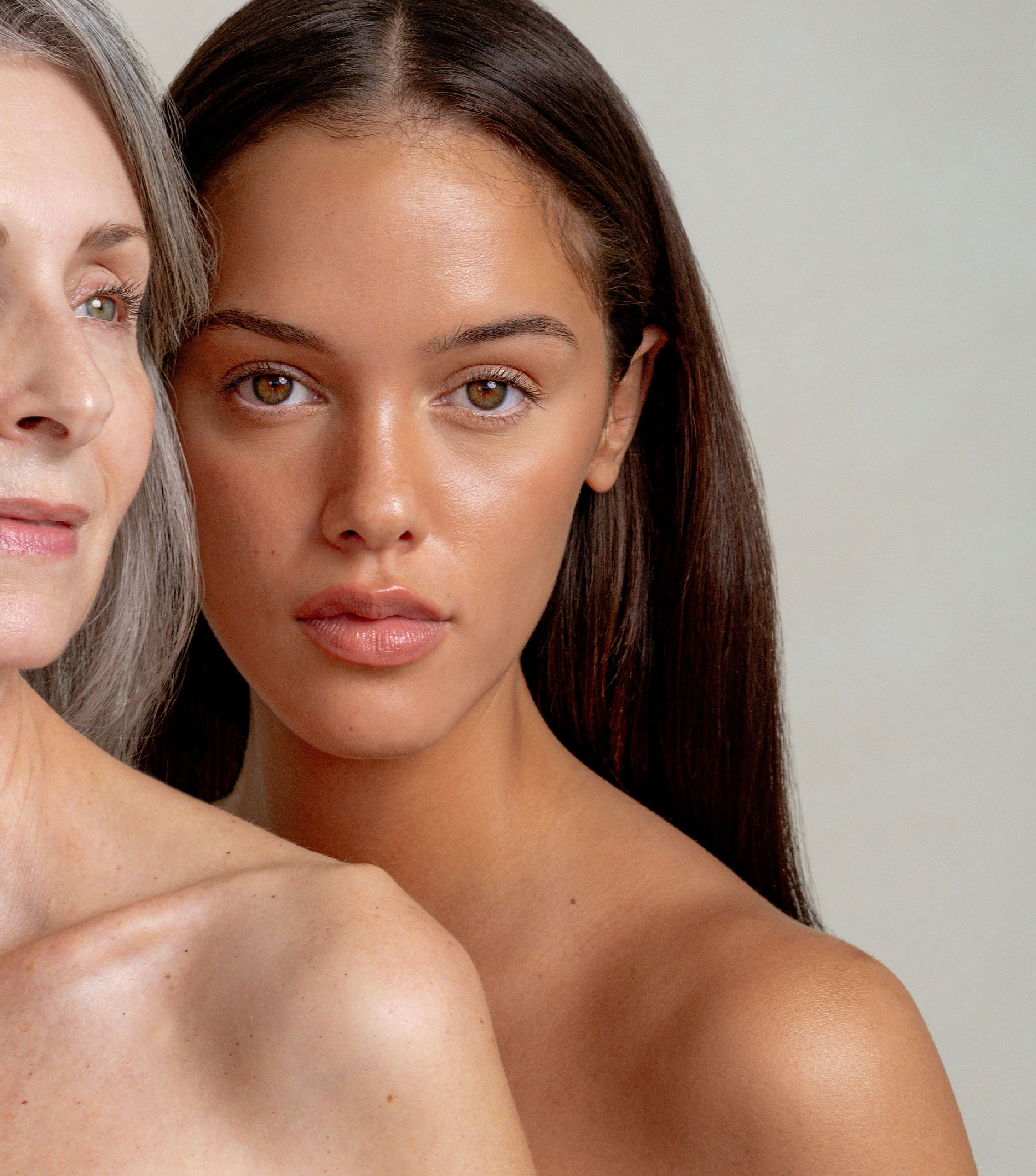
Skin Wellness
Putting the Human Back into Healing
Brand Messaging
Branding
Campaign
Web Design
Marketing Collateral
Real Estate
Artifx
Bring Art to Development
Branding
Brand Messaging
Interior Design
Iconic by Kaitlyn Wolfe
Where Structure Meets Story
Brand Messaging
Branding
Campaign
Web Design
Social Media
Interior Design
Kaitlyn Wolfe
Balance in Contrast
Brand Messaging
Branding
Campaign
Email
Marketing Collateral
Interior Design
Earthen Interiors
Boldly Designed, Naturally Refined
Brand Messaging
Branding
EGC
Web Design
Food & Beverage
Sante
Poured with Personality, Bottled for the Moment
Brand Messaging
Branding
Campaign
Marketing Collateral
Naming
Hospitality
Lylo Swimclub
A Sonoran Spin on Poolside Cool
Print
Marketing Collateral
Architecture
Portica
A New Wave of Architecture
Brand Messaging
Branding
Campaign
Web Design
Social Media
Food & Beverage
Soften
A Ritual in Every Sip
Branding
Packaging
Health & Wellness
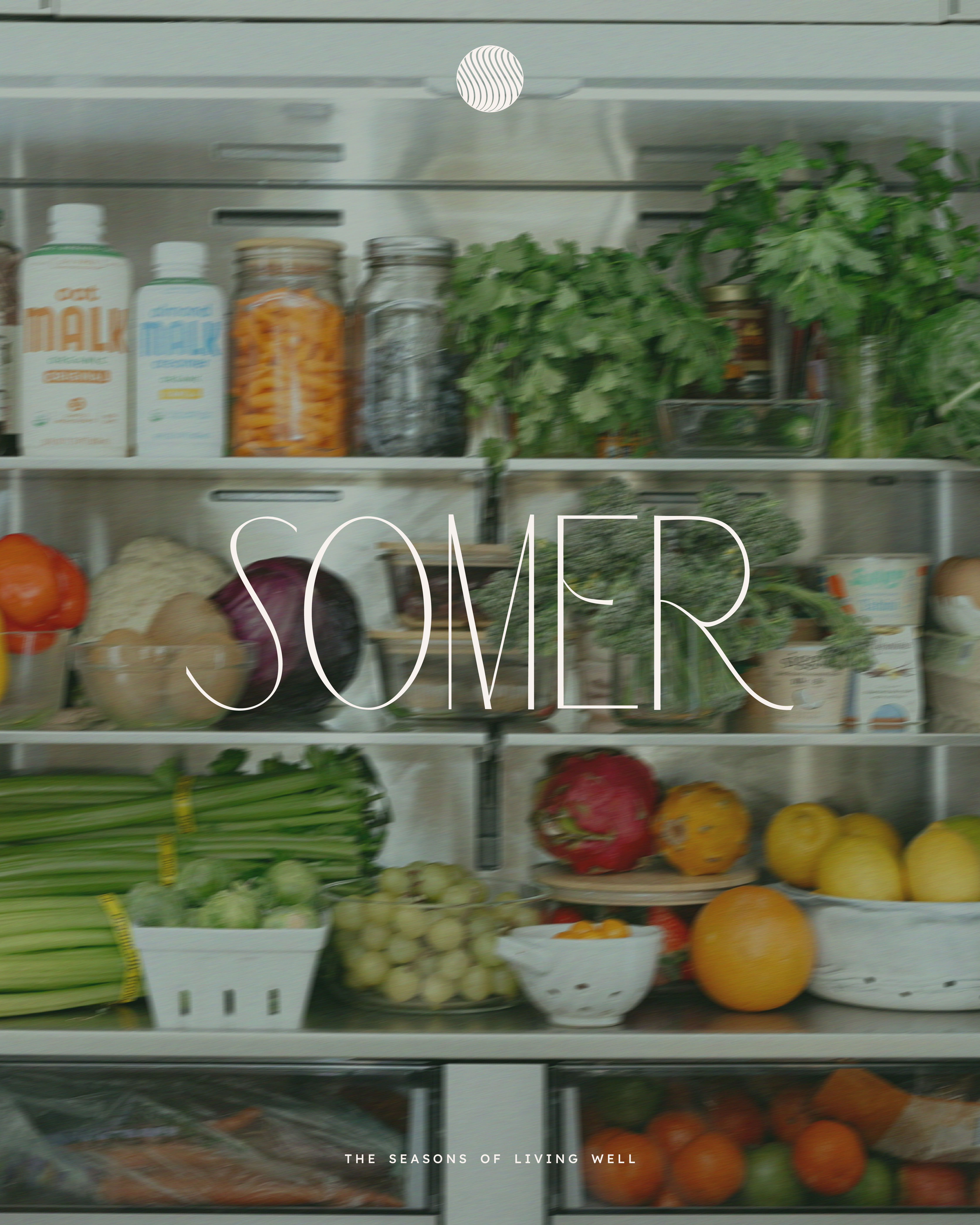
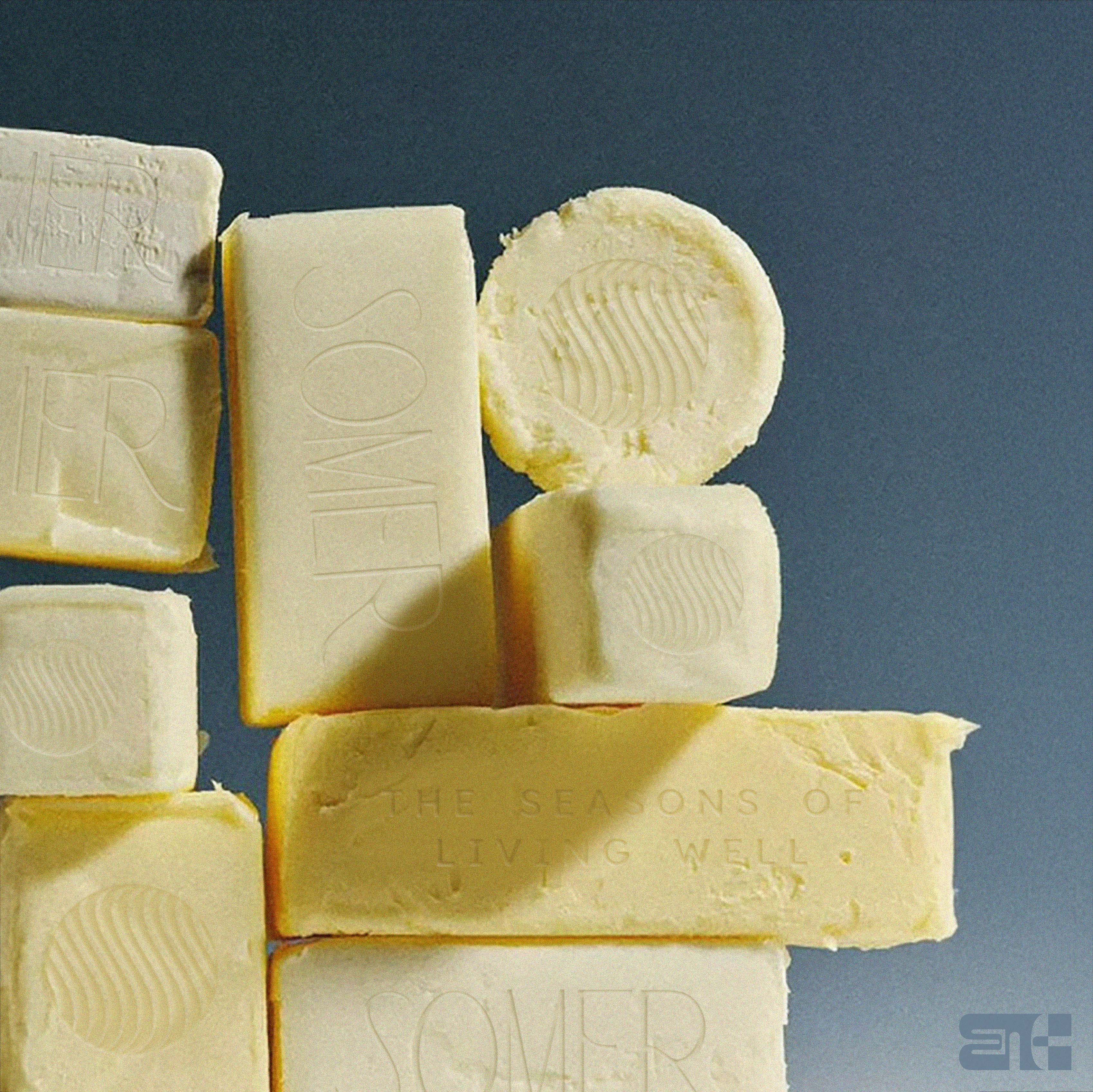
Somer
A Season of Intentional Branding
Brand Messaging
Branding
Campaign
Naming
Strategy
Health & Wellness
CFSS
Rebranding the Future of Mental Health
Branding
Campaign
Web Design
Real Estate
Whyte House
Built on Legacy, Rooted in Home
Brand Messaging
Branding
Campaign
EGC
Marketing Collateral
Fashion
Savoir
Where the Finer Things Live
Brand Messaging
Branding
Campaign
EGC
Email
Health & Wellness
The Open Journal
Pamela Anderson’s Unfiltered Sanctuary
Branding
Food & Beverage
Action Wine
No Guts, No Glory
Branding
Web Design
Fashion
Olea
Coastal Curations Made Timeless
Brand Messaging
Branding
Campaign
Strategy
Web Design
Beauty
Melt
Welcome to the Magic
Campaign
Marketing Collateral
Branding
Naming
Web Design
Health & Wellness
EYRA
Redefining Fitness with Precision & Purpose
Brand Messaging
Campaign
Marketing Collateral
Branding
Naming
_1598-2.jpg)
_1508-2.jpg)


.jpg)


_2046.jpg)


_1630.jpg)
_1213.jpg)