Everkind
A new kind of kind
services

When Megan, the founder of Everkind, came to ENC, she wasn't just launching a brand. She was sparking a reclamation. A redefinition of kindness, power, and what it means to be a woman in motion. But first, she needed the container to hold it all. The name, the message, the visuals, the voice.

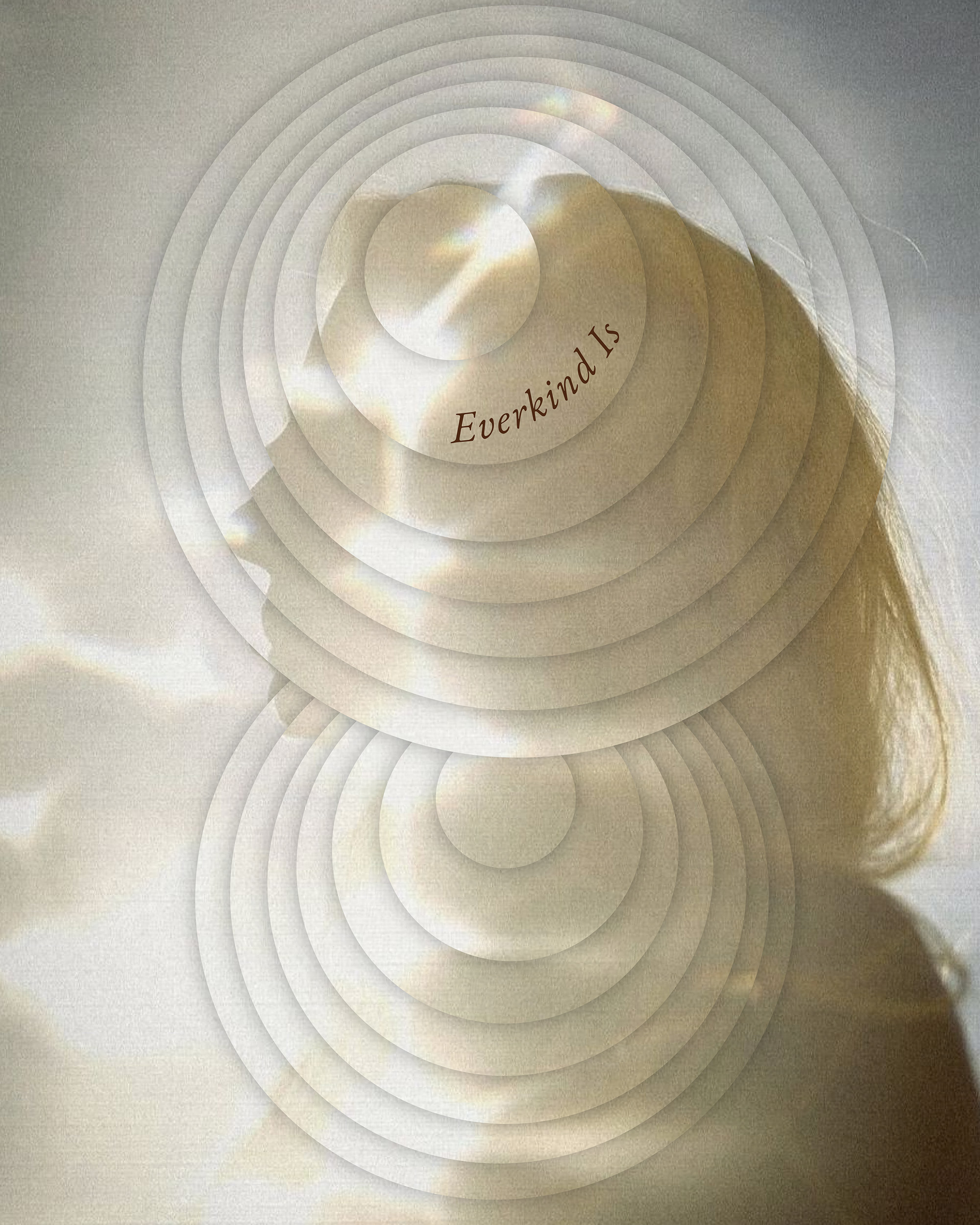
From naming to narrative, we helped bring Everkind to life as more than a collective. It's a call to expansion. We crafted messaging rooted in radical self-discovery and honest connection that doesn't just speak to women, it speaks from them. Visually, the brand needed to hold multitudes. A palette moving between grounded terracottas, soft earth tones, and windswept seafoam. A wordmark that is architectural but organic, soft edges meeting strong lines. And a brand symbol built from a fingerprint turned topography of the self, each ring a ripple, each curve a chapter.
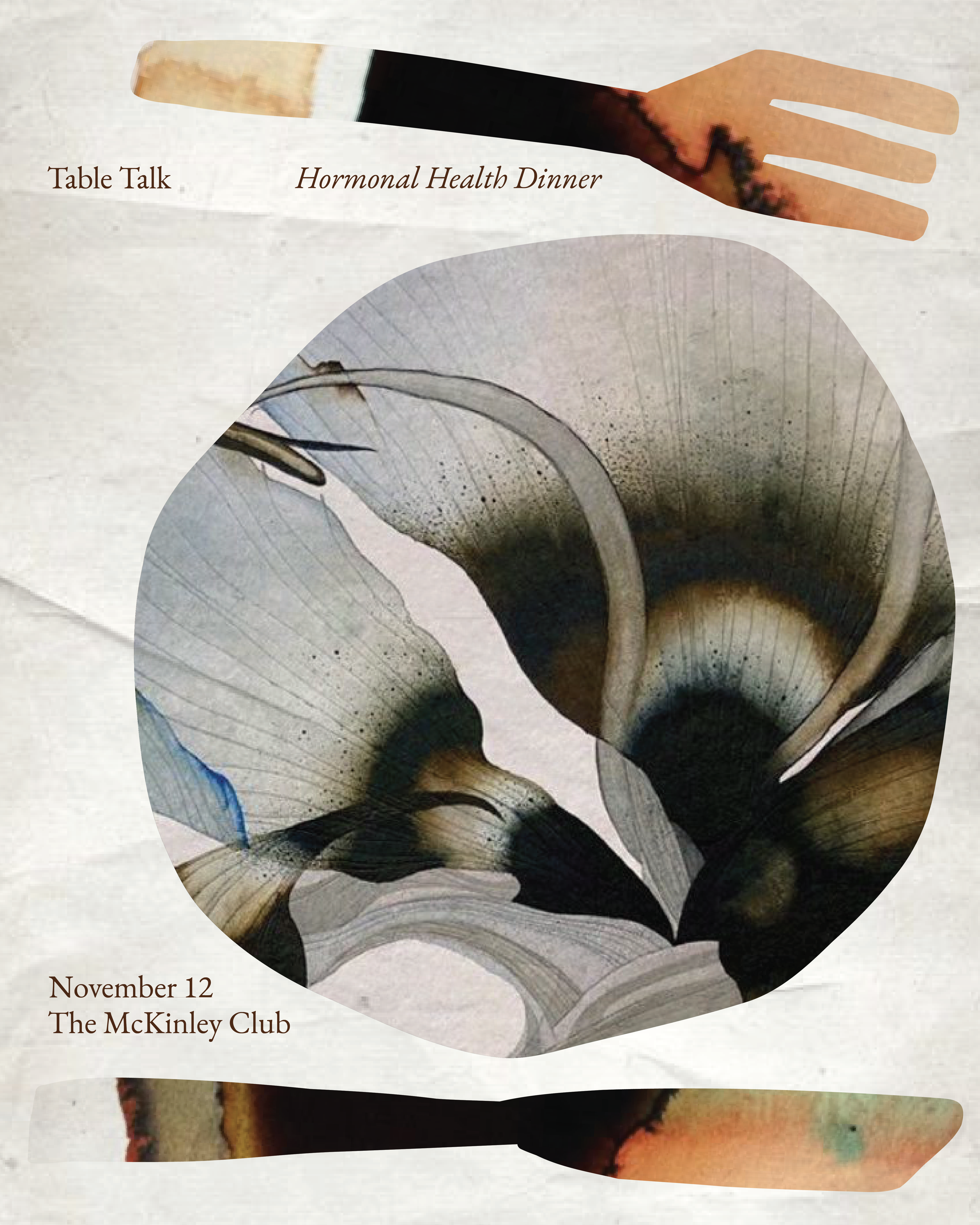
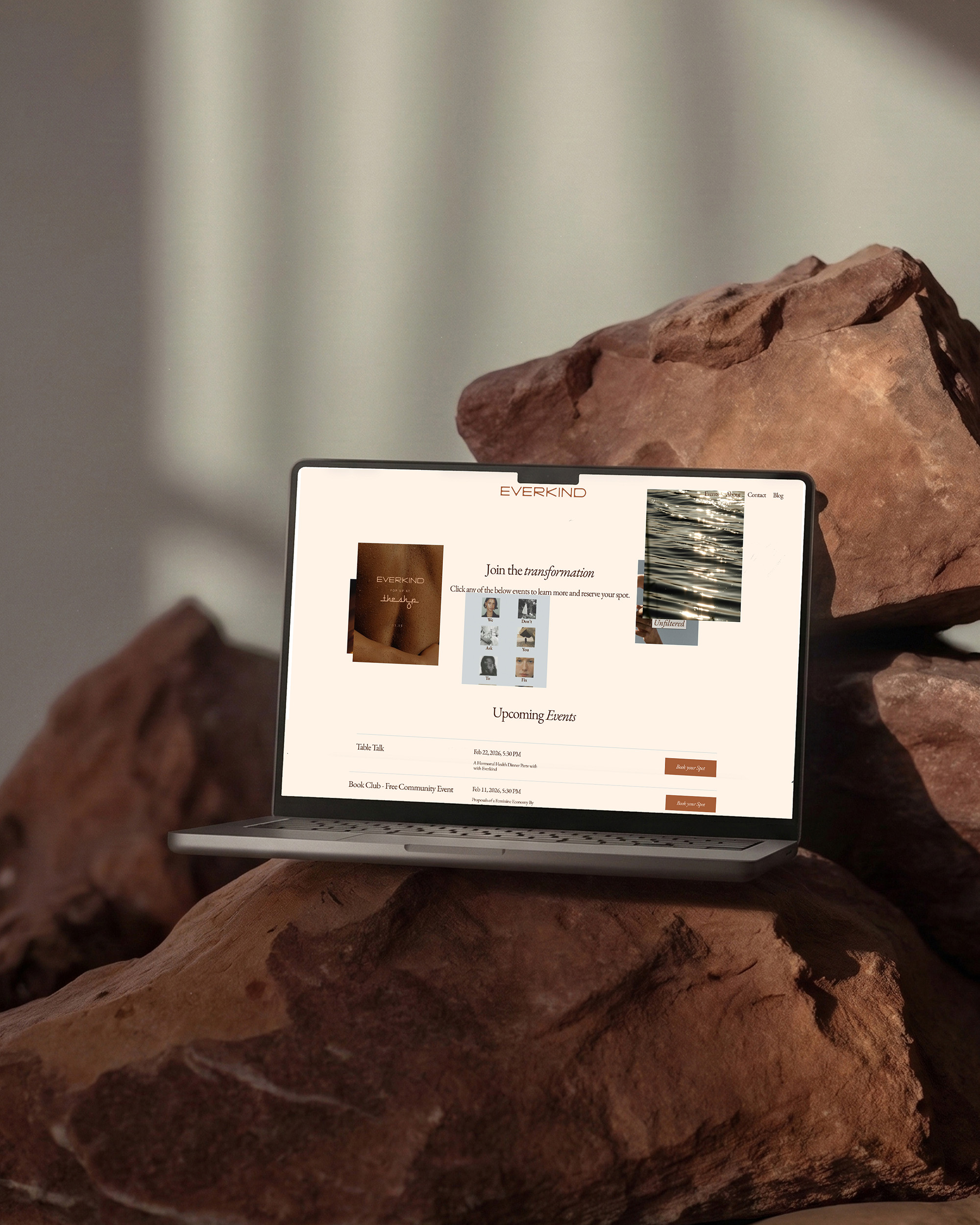

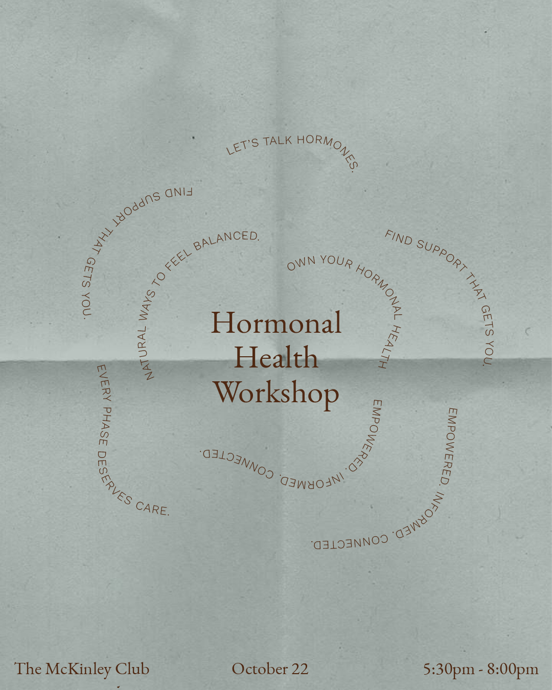
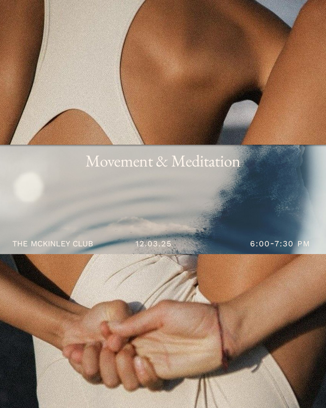
We extended the brand into a flexible suite of social assets, digital touchpoints, and event collateral, everything from leave-behinds to recipe books for their gatherings. Every piece was designed to feel like coming home to yourself. From naming to brand visuals to in-person experience, Everkind isn't just a brand. It's a movement wrapped in resonance. And we're proud to have been there from the very first breath.