Dylann Wolfe
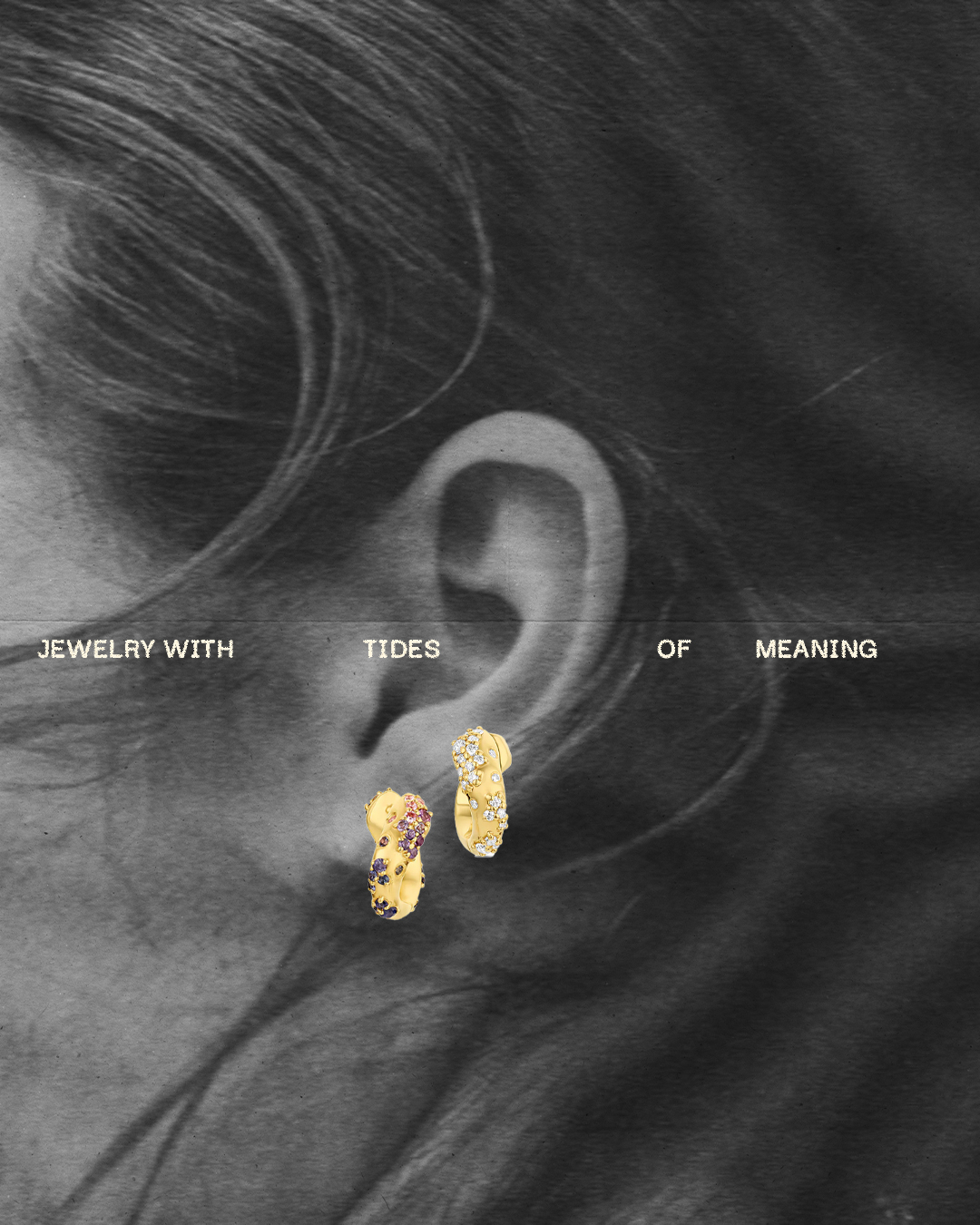
Born of the sea. Bound to Protect It.
services
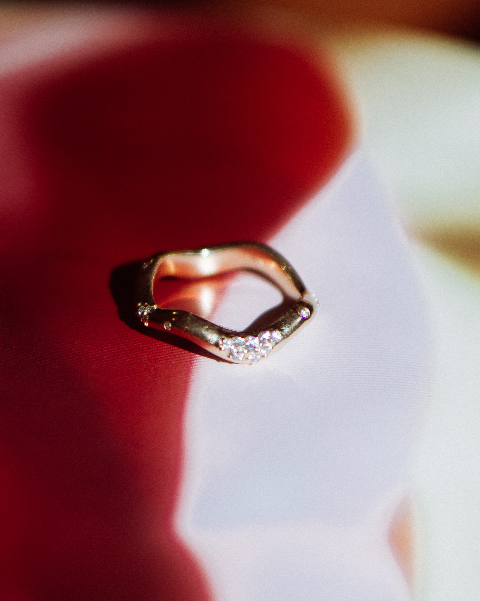
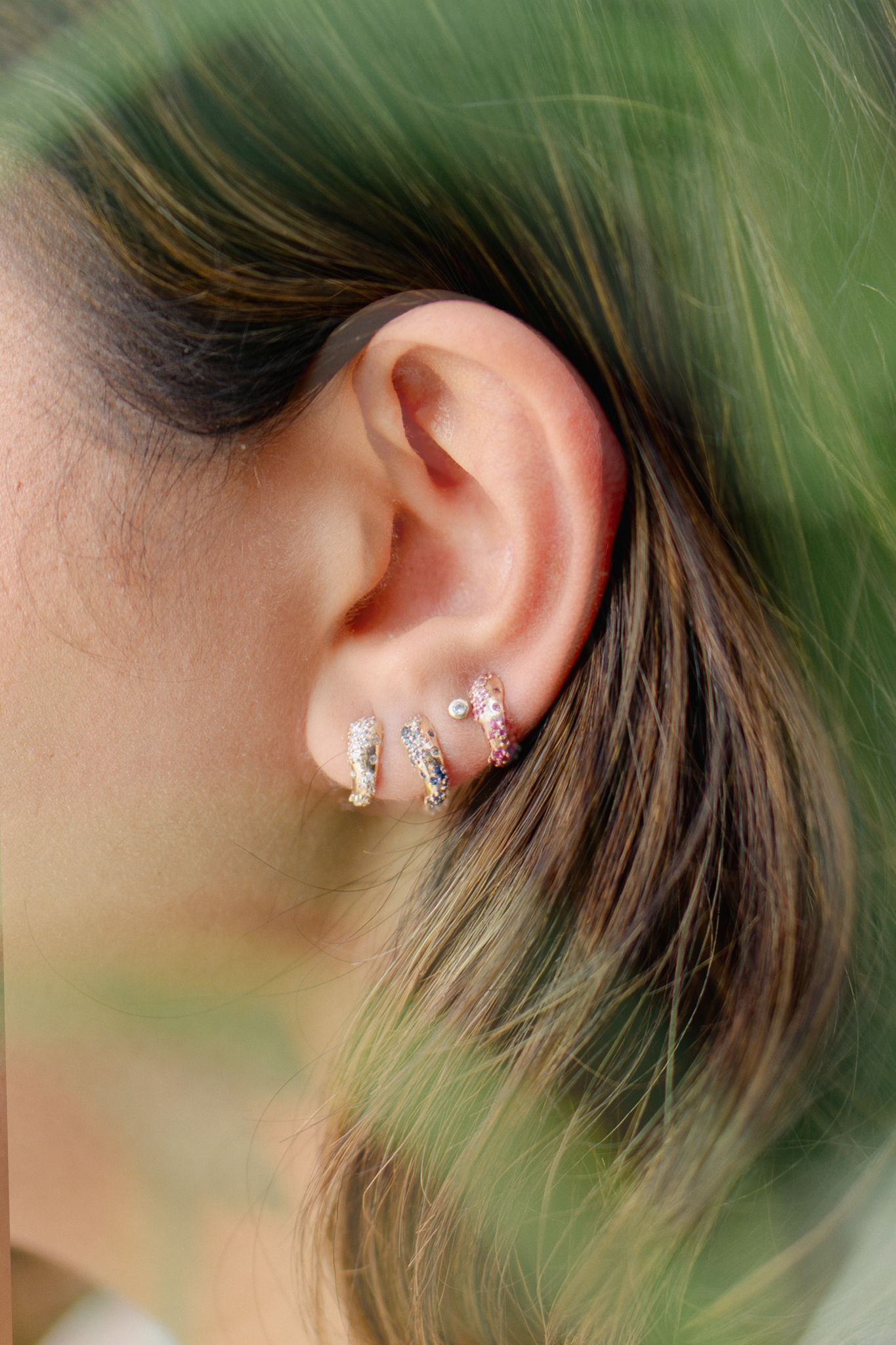
The vision for Dylann Wolfe was already crystal clear: build a jewelry brand that didn't just sparkle, but stood for something. A brand that could turn adornment into activism. That could protect what's precious, from the gem in your ring to the ocean it came from. The mission was bold. It just needed a brand strong enough to carry it.

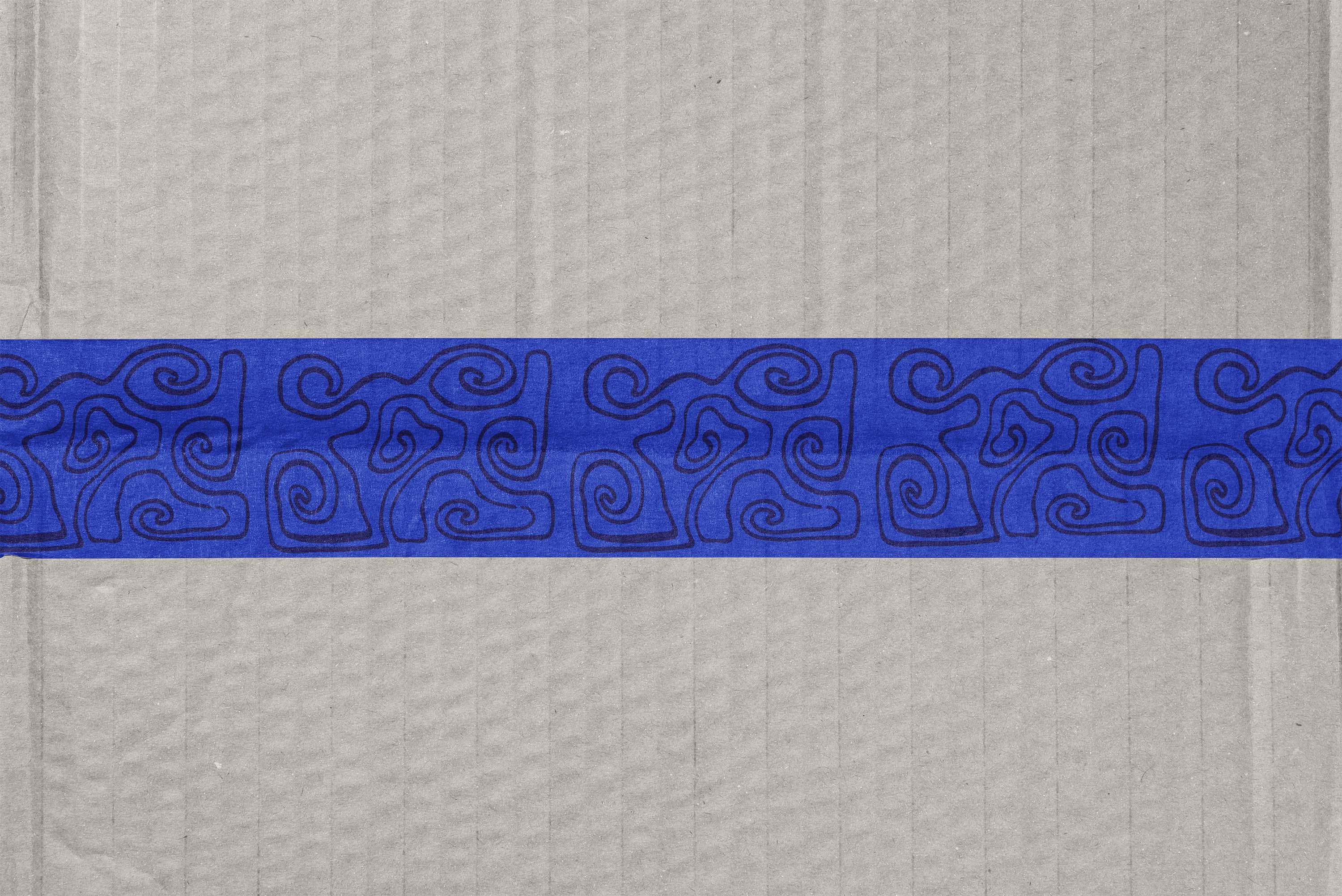
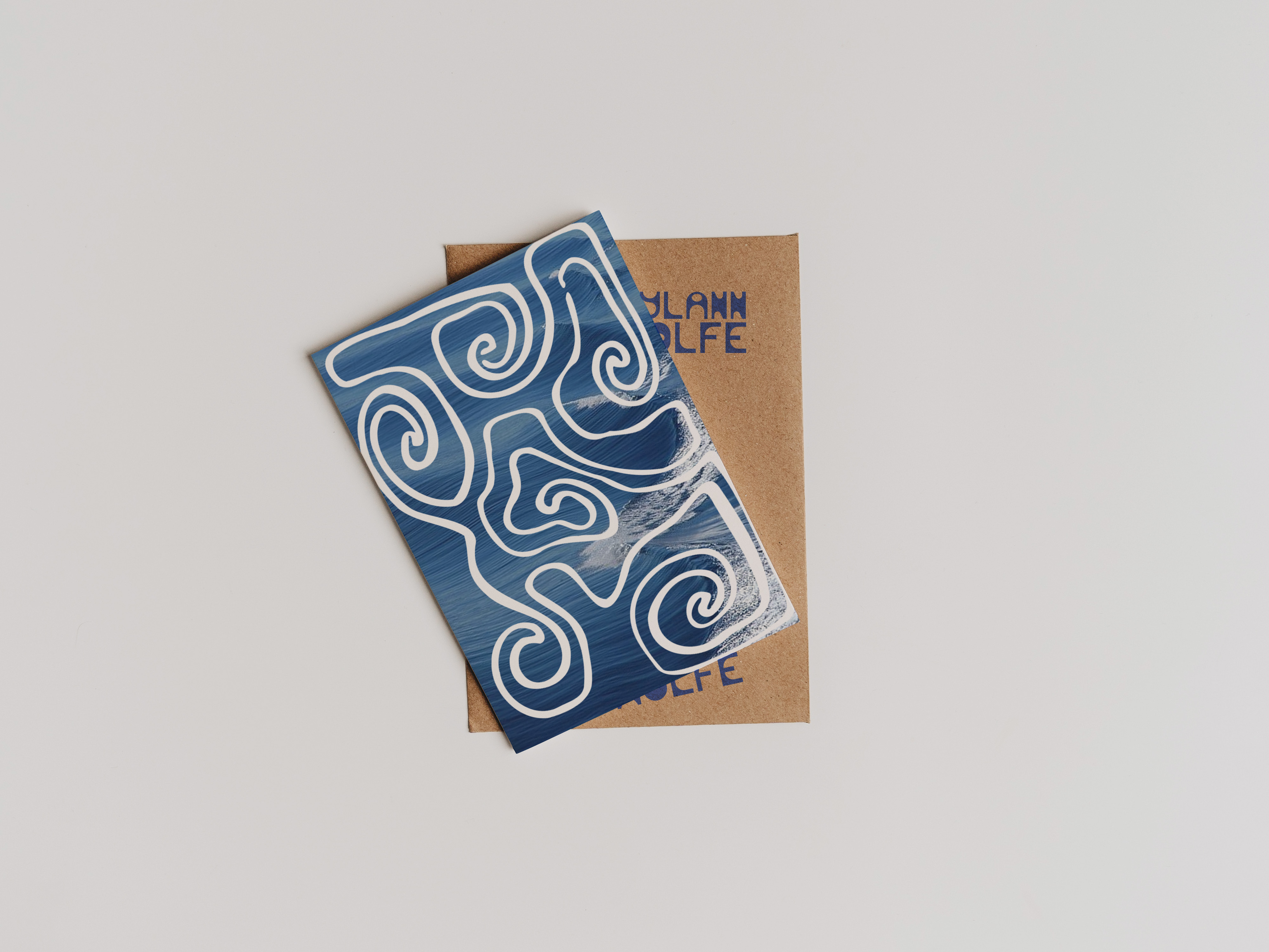
From the ground up, we crafted a brand that holds weight and water. We developed Dylann Wolfe's entire verbal identity: messaging, tone, ethos, and storytelling centered on traceability, transparency, and environmental protection without sacrificing elegance or edge. Then we built the visual identity to match, from a logo that channels the movement of the sea to a moody, refined color palette and custom type system. The textures of coastline and the language of rebellion layered into every corner of the brand.

We're bringing it all to life through a website designed to educate and convert, and social assets built for movement, momentum, and meaning. Dylann Wolfe isn't just another jewelry line. She's a call to action. Jewelry that feels like poetry but hits with purpose. Because when your pieces are born of the sea, your brand has to rise to meet it.