Need To Know
Concept Driven Design Studio
services


Need to Know already had the portfolio. The guts. The instinct. The jaw-dropping spaces that made you stop and say, "who did this?" But their brand wasn't quite matching that same energy. They had the work, the edge, the personality. The foundation just needed some finessing.
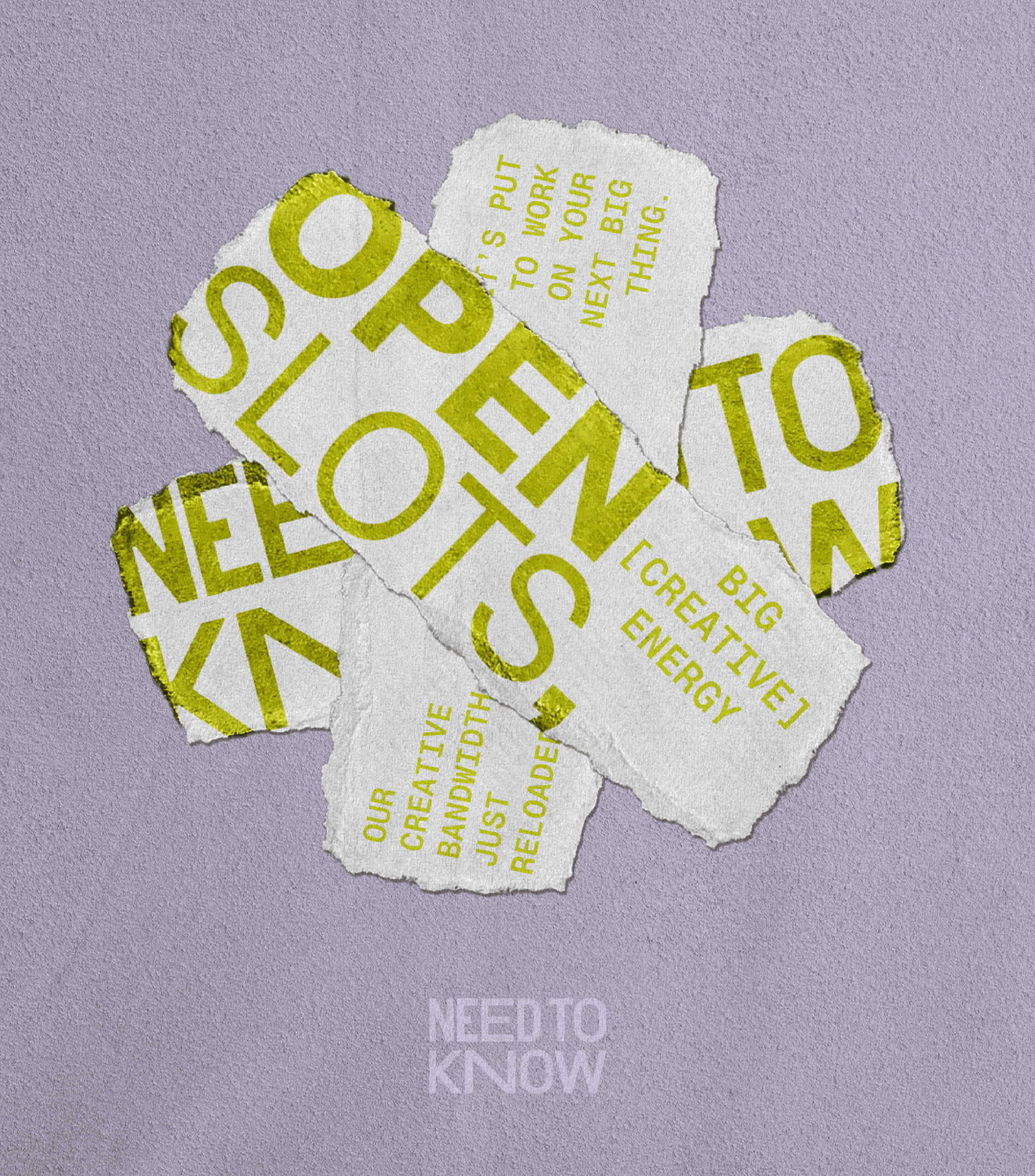
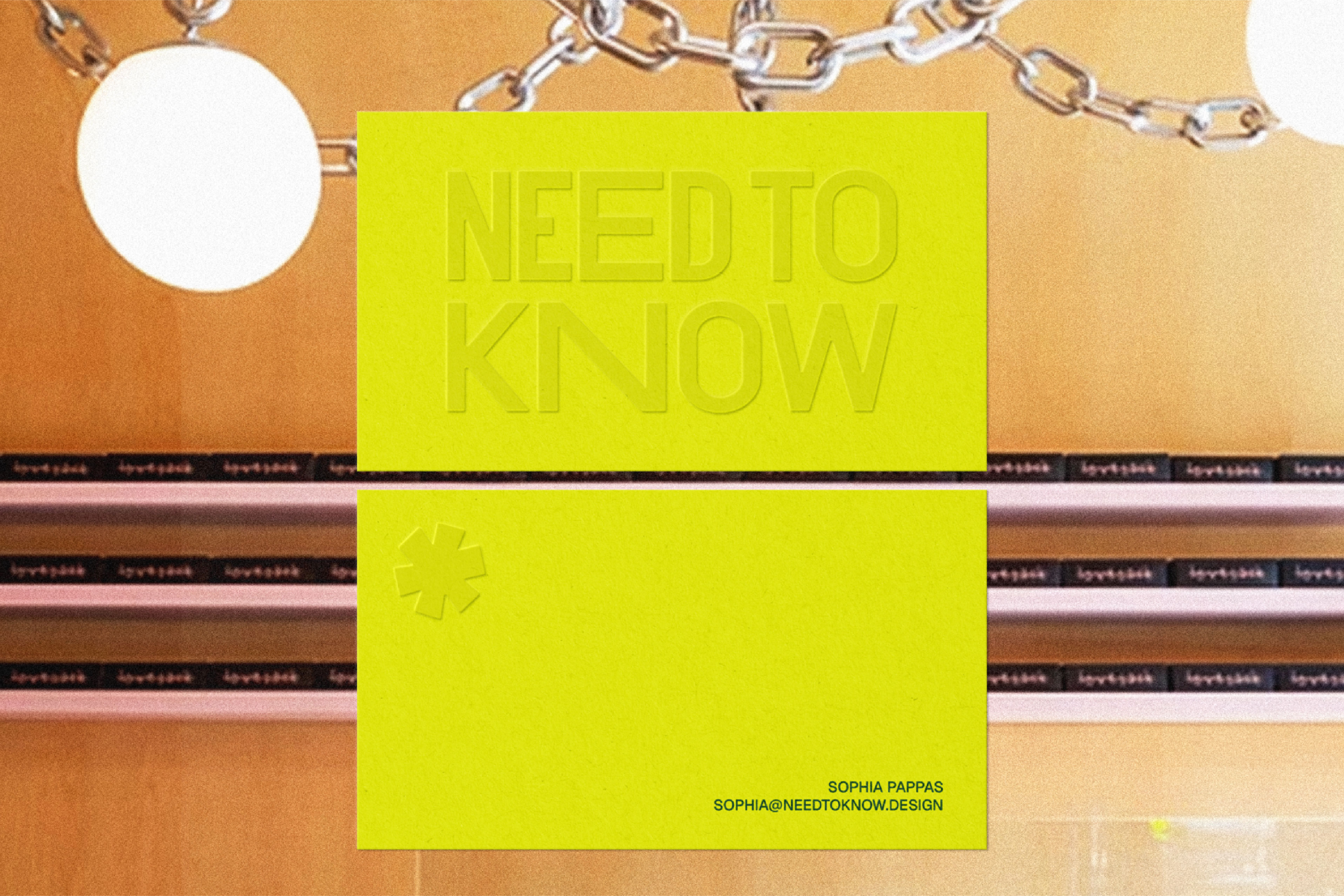
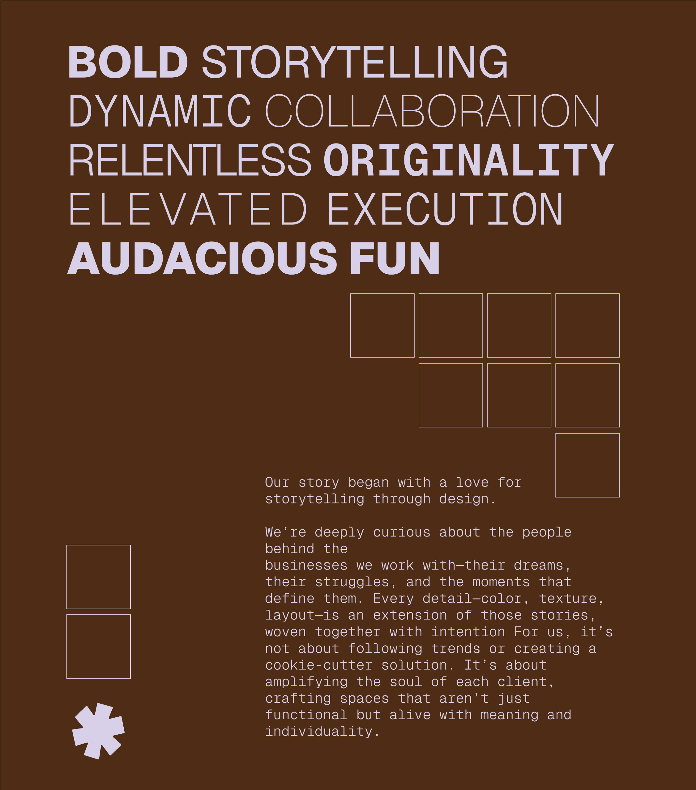
We started with messaging that nailed their ethos: polished meets playful, chaos-fueled genius, and a refusal to settle for ordinary. From there, we cleaned up their branding with a fresh type kit and an unmissable color palette. Citrus yellow, jade green, fiery red, moody black, and a lilac that doesn't play by the rules. We revisited the logo too, making it all punch and no fluff. Sharp, strong, and ready to lead. Then there was the asterisk: a visual exclamation point and a reminder that every NTK space carries a little spark, a little swagger, and a whole lot of story.

The result is a brand system just as daring and electric as the interiors they're known for. Since our work together, Need to Know has continued to scale with style and the collaboration has only grown stronger. NTK on interiors, ENC on brand. Just how we like it.