
Wellness Is Made at MEND.
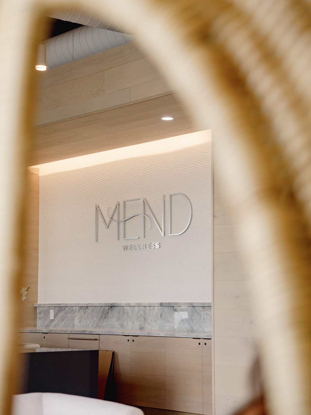
Wellness is a little different for everyone. Sometimes it's a morning movement class, sometimes it's a much-needed recovery session, and sometimes it's simply waking up feeling like yourself again. MEND Wellness Collective brings movement, recovery, restoration, and ritual together under one thoughtfully curated roof, creating space for people to find their own rhythm of feeling well. With an approach to whole-body wellness that extends beyond the workout, MEND makes room for the practices, people, and everyday moments that help us feel our best. Our job was to give that philosophy a visual language and brand experience people could recognize.
A Little More Feeling. A Lot More MEND.
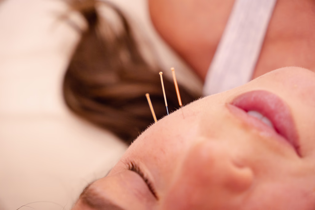
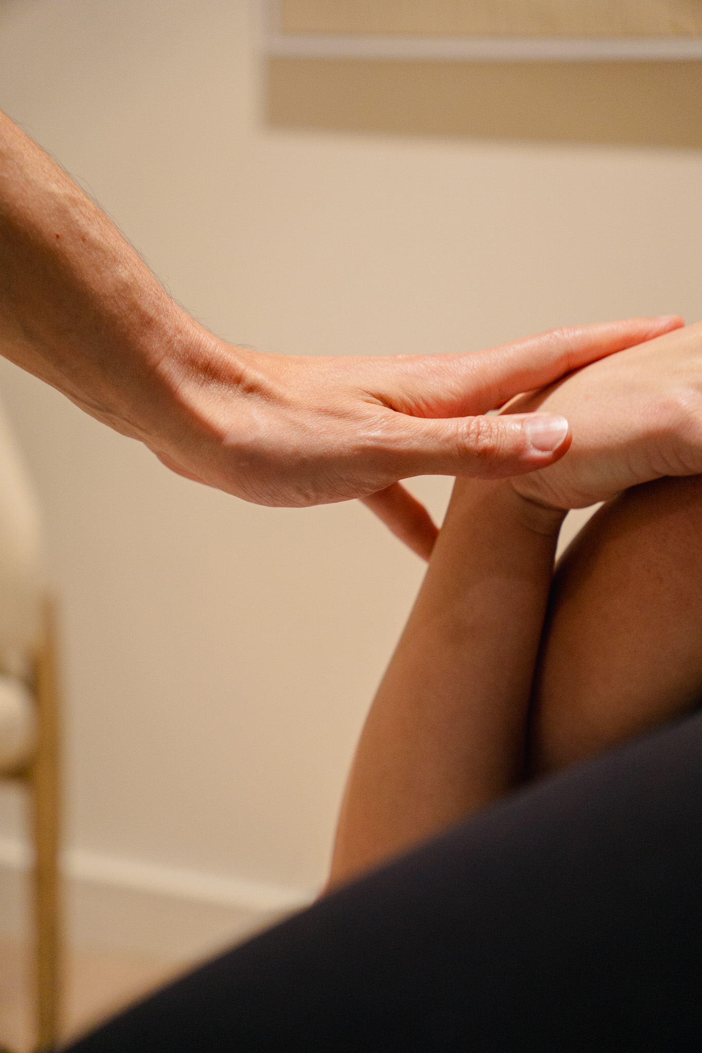
We started with the details that make a brand feel like itself. A custom collection of delicate, line-drawn illustrations gave MEND's many wellness modalities a shared visual language, bringing everything from yoga and massage to fertility wellness and sound healing into the same family. We explored an earthy, nature-inspired color palette of grounding greens, warm neutrals, and soft, tonal hues, paired with a typography system that balances quiet sophistication with an inviting sense of ease. The result is a flexible brand identity system that feels as considered as the collective itself, with room for each offering to have its own personality. Every color, curve, and character helps tell the same story: wellness is personal, and there's room for all of it here.
Something Is Mending.
Before MEND opened its doors, we had a feeling to introduce. Our launch campaign, Something Is Mending, leaned into anticipation with intimate imagery, thoughtful brand messaging, and glimpses of the movement, recovery, and rituals to come. We built a visual storytelling approach around the idea that people would recognize MEND by how it made them feel, using lines like "You'll know it by the feeling" to create curiosity and connection. Editorial photography, layered compositions, and a little well-placed mystery helped establish the collective's personality before the full experience was revealed. From the first tease to the welcome, the campaign gave MEND a story worth following.
Your Wellness World All in One Place.
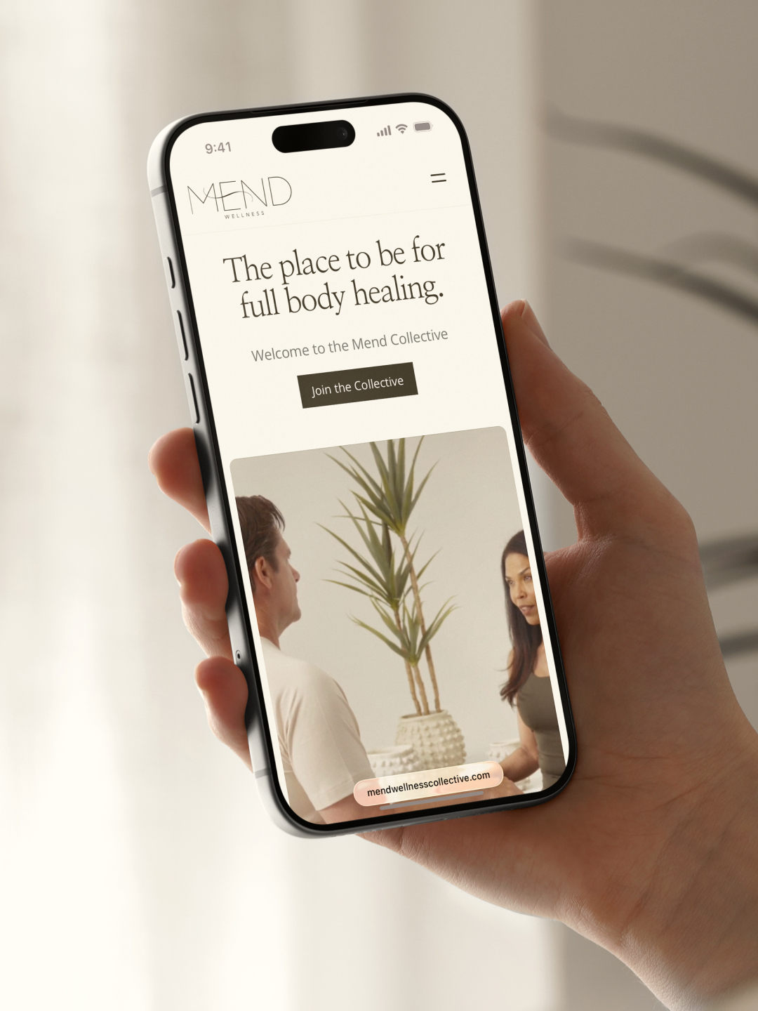
When your wellness collective offers a little bit of everything, your website has some serious explaining to do. We designed and developed a digital home for MEND that makes an expansive world of wellness feel beautifully approachable, bringing together an encyclopedia of modalities, services, and experiences in one intuitive destination. Visitors can explore the benefits of different practices, discover what speaks to them, and find their own way into the collective through memberships, packages, or one-time experiences. Through thoughtful website architecture, we created a platform that makes discovering, understanding, and engaging with MEND feel like a natural next step.
A Whole Lot of Wellness to Introduce to the Algorithm
With so many ways to feel well, MEND had plenty to talk about, and we wanted every introduction to feel as calming as the experience itself. We brought the brand to life through thoughtful print collateral, environmental graphics, and a social media strategy that gave the collective a personality long before its doors opened. From the earliest Something Is Mending teasers to the introduction of individual modalities, we created a content ecosystem rooted in editorial imagery, intentional design, and brand messaging that made wellness feel inviting and personal. Every post, campaign, and printed detail became another opportunity to build recognition, spark curiosity, and invite people into the collective. A brand experience that could travel from someone's Instagram feed straight into their everyday wellness routine.